When people fear being scammed,
trust becomes the product.
How might we help undocumented immigrants feel safe enough to seek and access verified legal support?
How might we help undocumented immigrants feel safe enough to seek and access verified legal support?
Working alongside community organisations supporting undocumented immigrants across the Bay Area, I kept hearing the same story: people weren’t failing to find help because resources didn’t exist. They were failing because they couldn’t tell who was trustworthy.
“I’ve lived here most of my life, but I still feel like I’m walking on eggshells.”
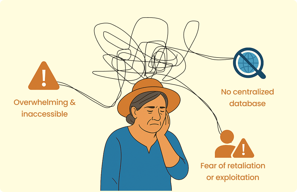
Research participantFake legal services, language barriers, and fear of exposing immigration status created a crisis of trust. The challenge wasn’t access to information — it was access to information they could believe.
Over three weeks, I conducted 12 interviews with undocumented individuals, legal advocates, nonprofit leaders, and community workers. One pattern appeared in every session: the challenge wasn’t access to resources — it was access to trustworthy resources.
View detailed research appendix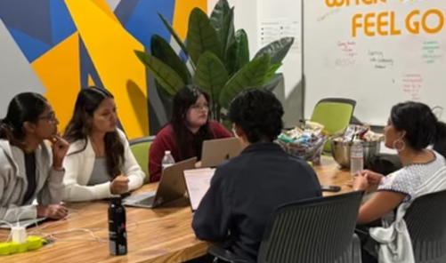
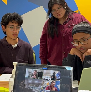
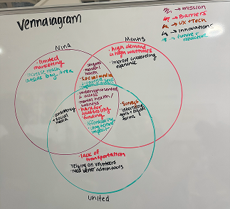
Field interviews with community members and legal advocates

Community organizations and legal advocates who we partned with and contributed to research
“Looking up legal help online felt like it could be a trap.”
Research participant“There are so many programs. It’s too much to figure out.”
Research participant“Google everything and sometimes I just give up.”
Research participant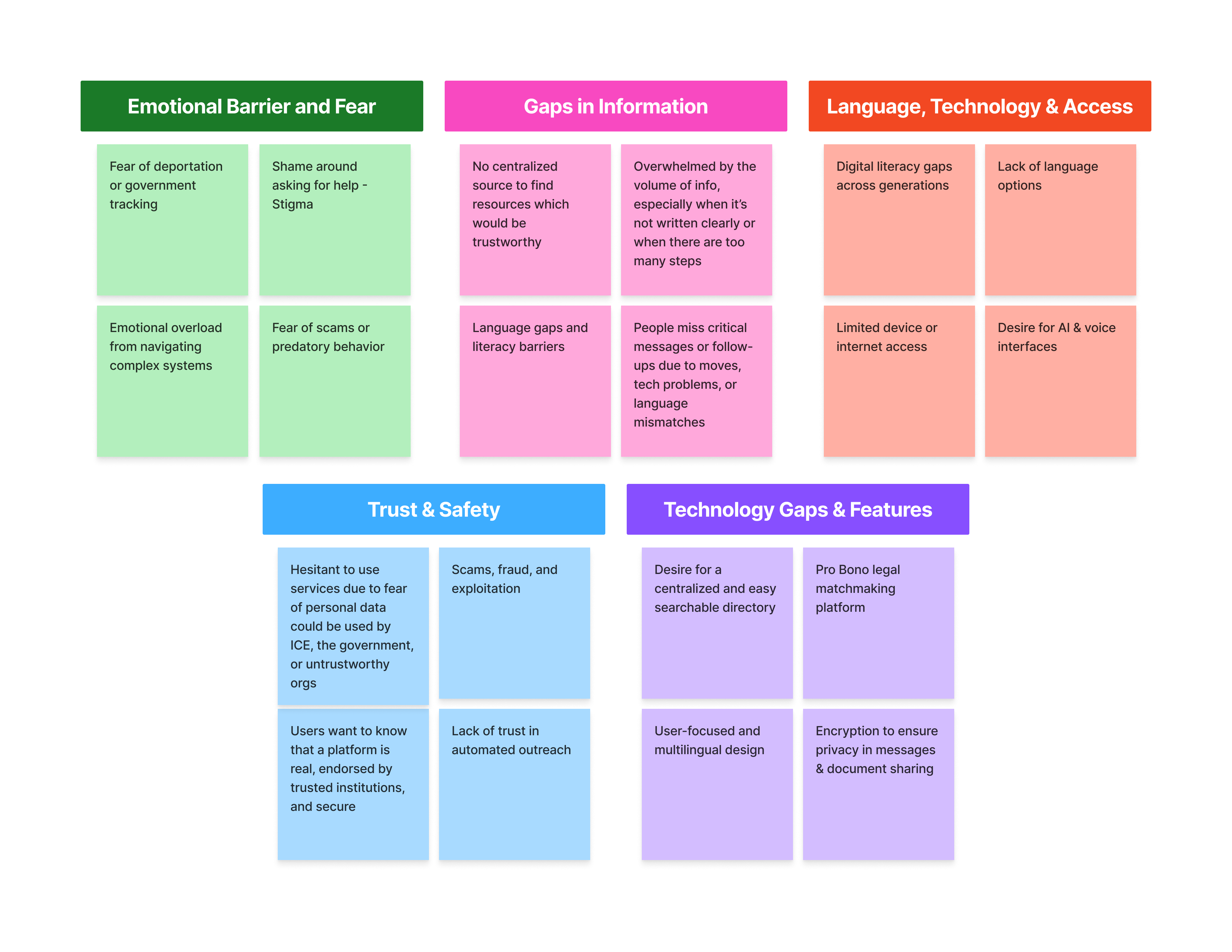
Research synthesis — affinity mapping
Fear of scams, deportation, and exposure caused users to avoid seeking help entirely — even when support was available.
Legal resources existed across nonprofits and advocacy groups but there was no trusted place to discover them.
Language barriers, low digital literacy, and legal jargon created friction at every step of the process.
Maria is a 70-year-old undocumented grandmother living in San Jose. Limited English proficiency, low digital literacy, and deep concerns about sharing information online. She represents the users most at risk of falling through the gaps.
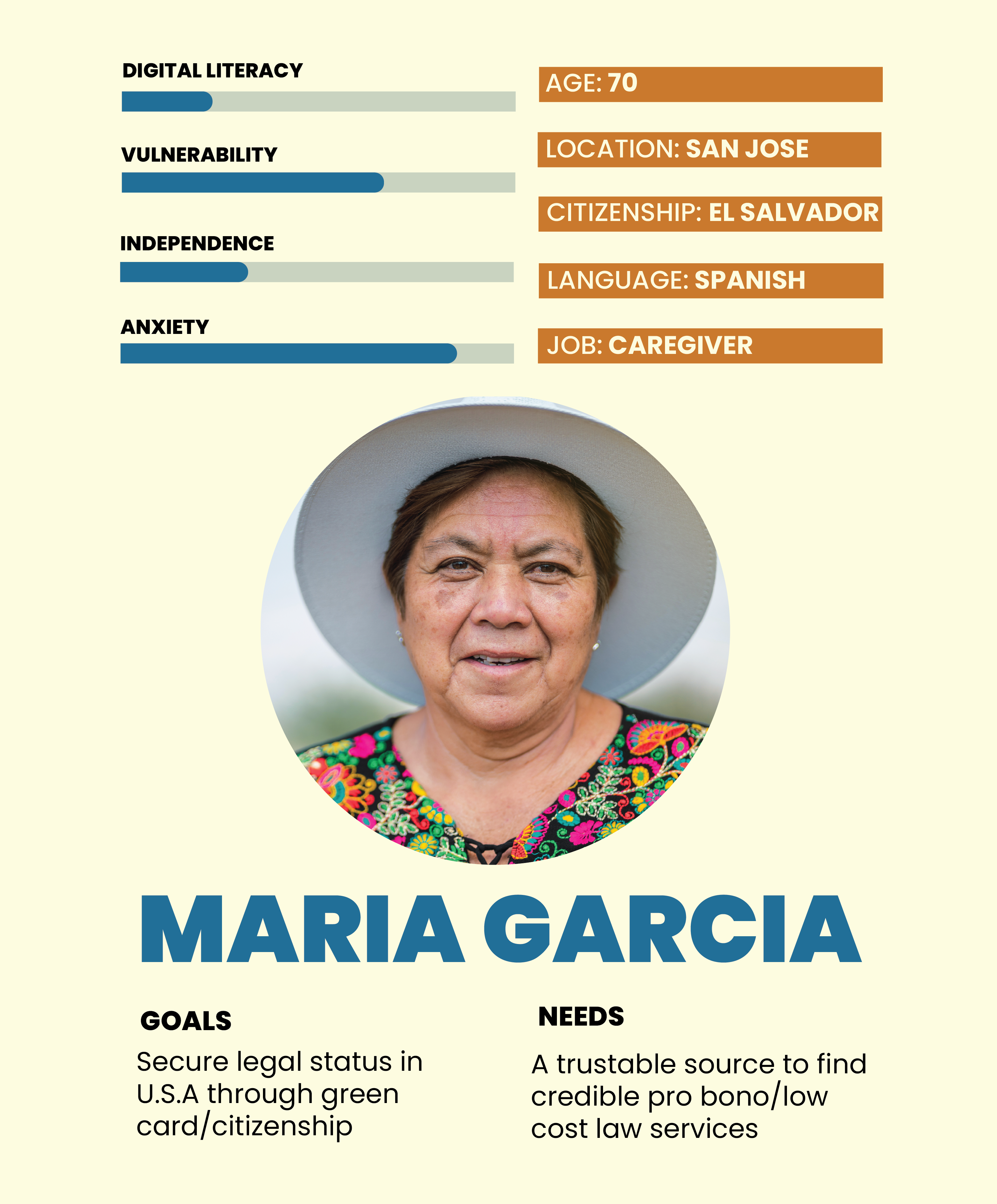
“If I share too much information, what happens to it?”
Persona quote — synthesised from interviewsFind trustworthy legal help without risking her family’s future.
Simple explanations, verified services, and clear next steps.
Legal processes feel overwhelming and impossible to navigate alone.
Being scammed, misled, or exposing her undocumented status.
We used Crazy 8s and dot voting to rapidly explore solutions around trust, accessibility, legal guidance, and fraud prevention.
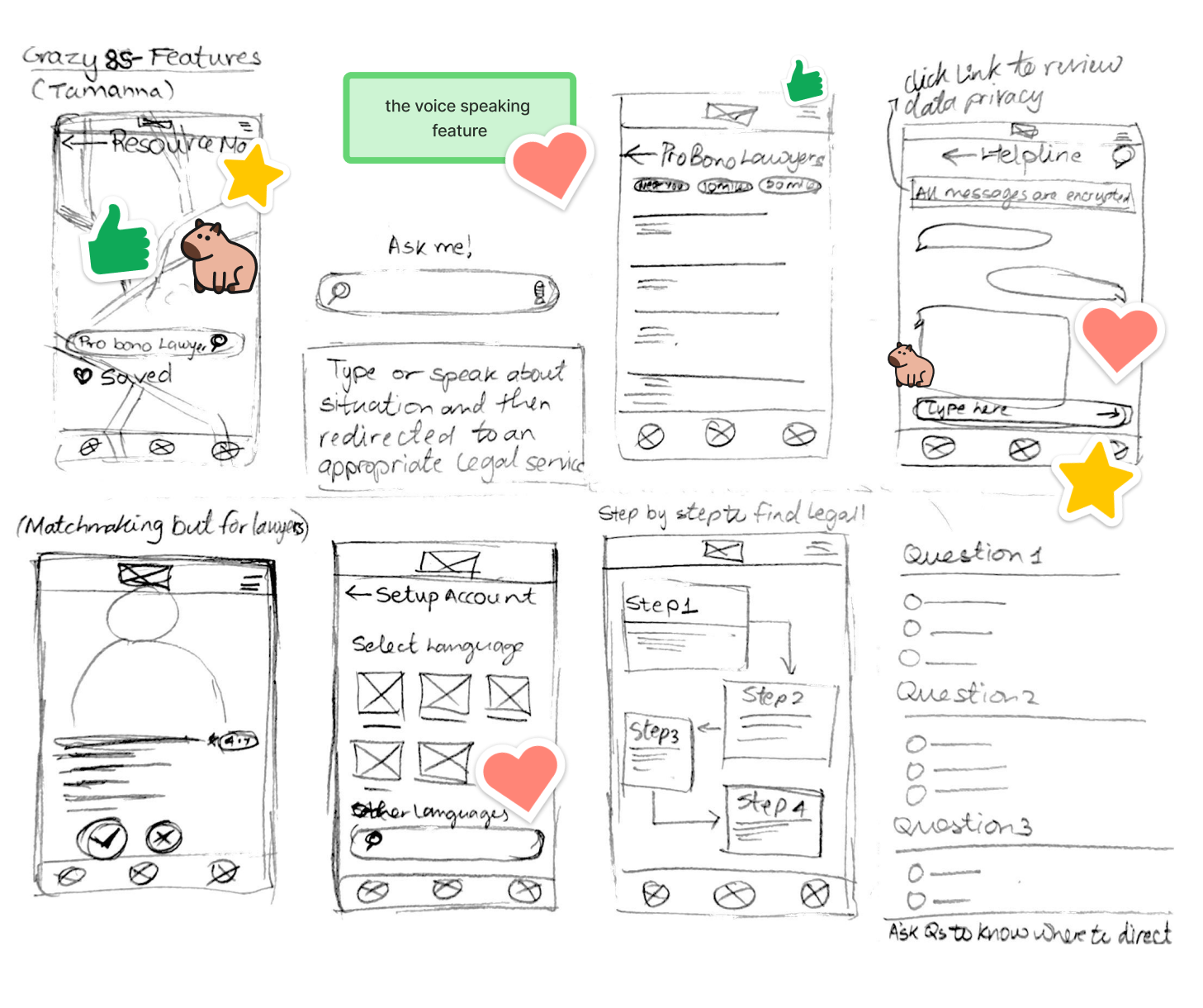
Crazy 8s + dot voting workshop
The strongest concepts weren't the most feature-rich. They were the concepts that reduced uncertainty and helped users feel safer.
This reinforced what we had already learned from research: users weren't looking for more information. They were looking for reassurance.
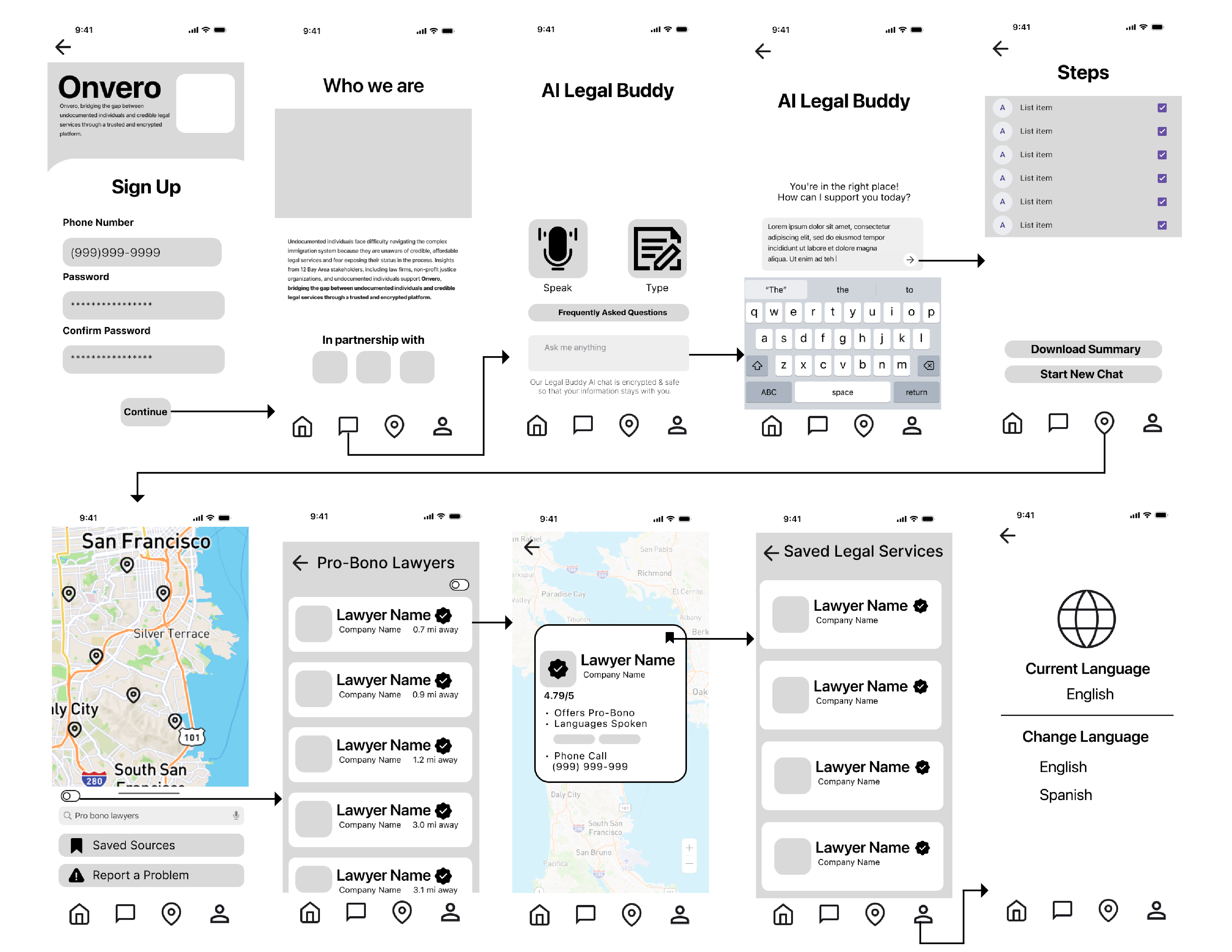
Mid-fidelity wireframes exploring onboarding, AI guidance, verification, and legal resource discovery
Our first round of testing revealed a deeper issue than usability. Users didn't trust the platform.
They questioned where their information was stored, whether legal services were legitimate, and whether Onvero was safe enough to use at all.
Trust wasn't a feature users wanted. It was a prerequisite for engagement.
This insight reshaped the entire product. Before improving navigation or refining interactions, we returned to the design process to rebuild the experience around trust.
Users receive access through trusted nonprofits or existing members, making distribution itself the first trust signal.
Every lawyer or legal organization is validated through community partners before appearing in the product.
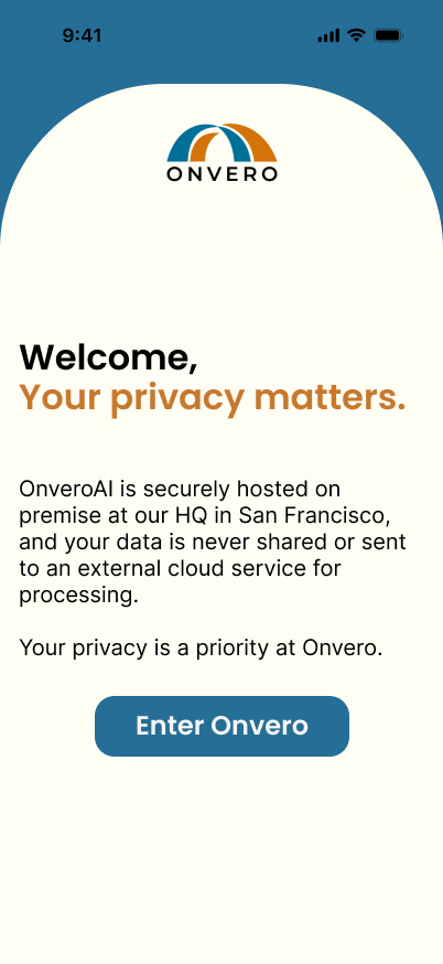
Privacy details appear upfront, so users understand how their information is protected before sharing anything.
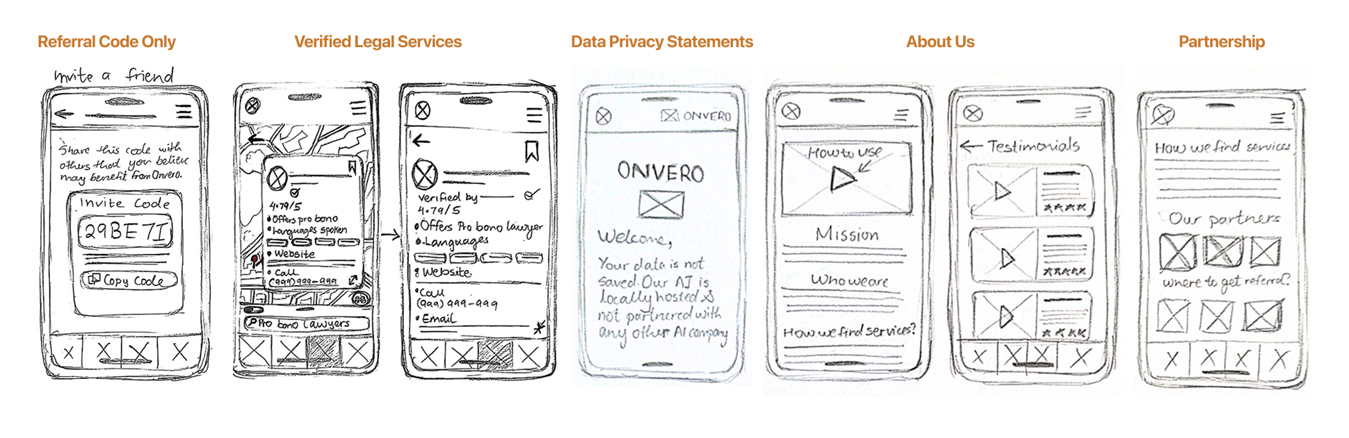
Sketches exploring referral access, provider verification, privacy-first onboarding, and trust cues
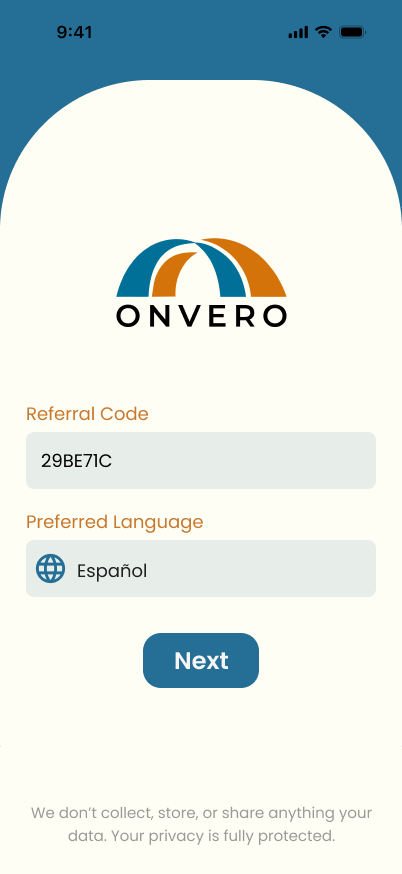
Users encountered too many choices at once on the landing page. Features competed for attention.
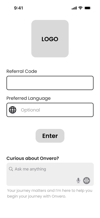
Simplified to a single primary path. Instead of presenting multiple options at once, including refining the UX writing reducing cognitive load.
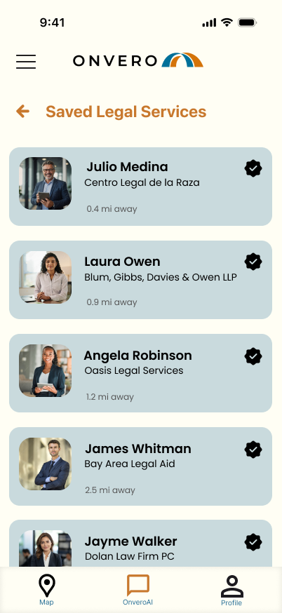
Large text blocks and inconsistent hierarchy made the interface feel intimidating. Users struggled to identify what was most important and often needed to jump between pages, disrupting their experience.
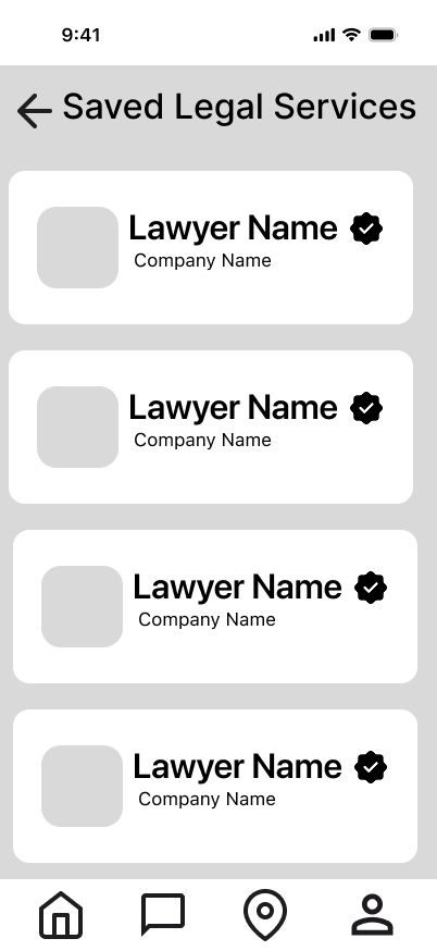
Introduced clearer typography, stronger spacing, and progressive disclosure. Information became easier to scan and users moved through with more confidence.
Users questioned the AI assistant immediately. “Legal Buddy” felt generic and raised concerns about ownership, credibility, and data storage.
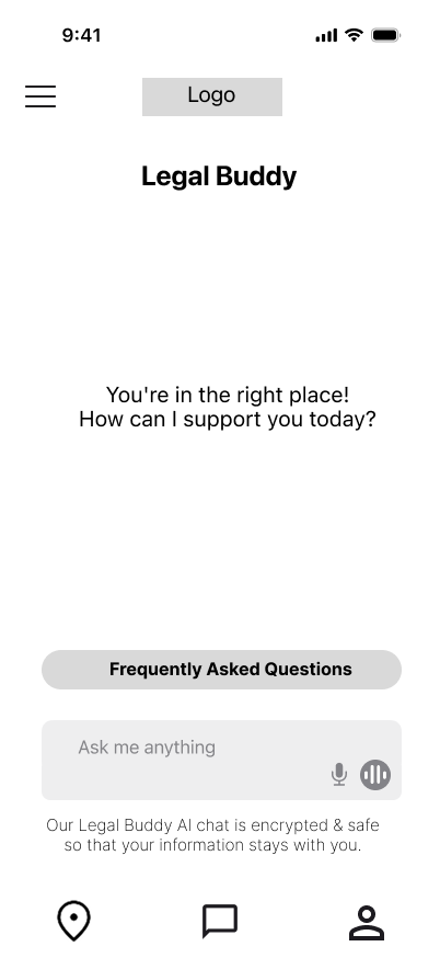
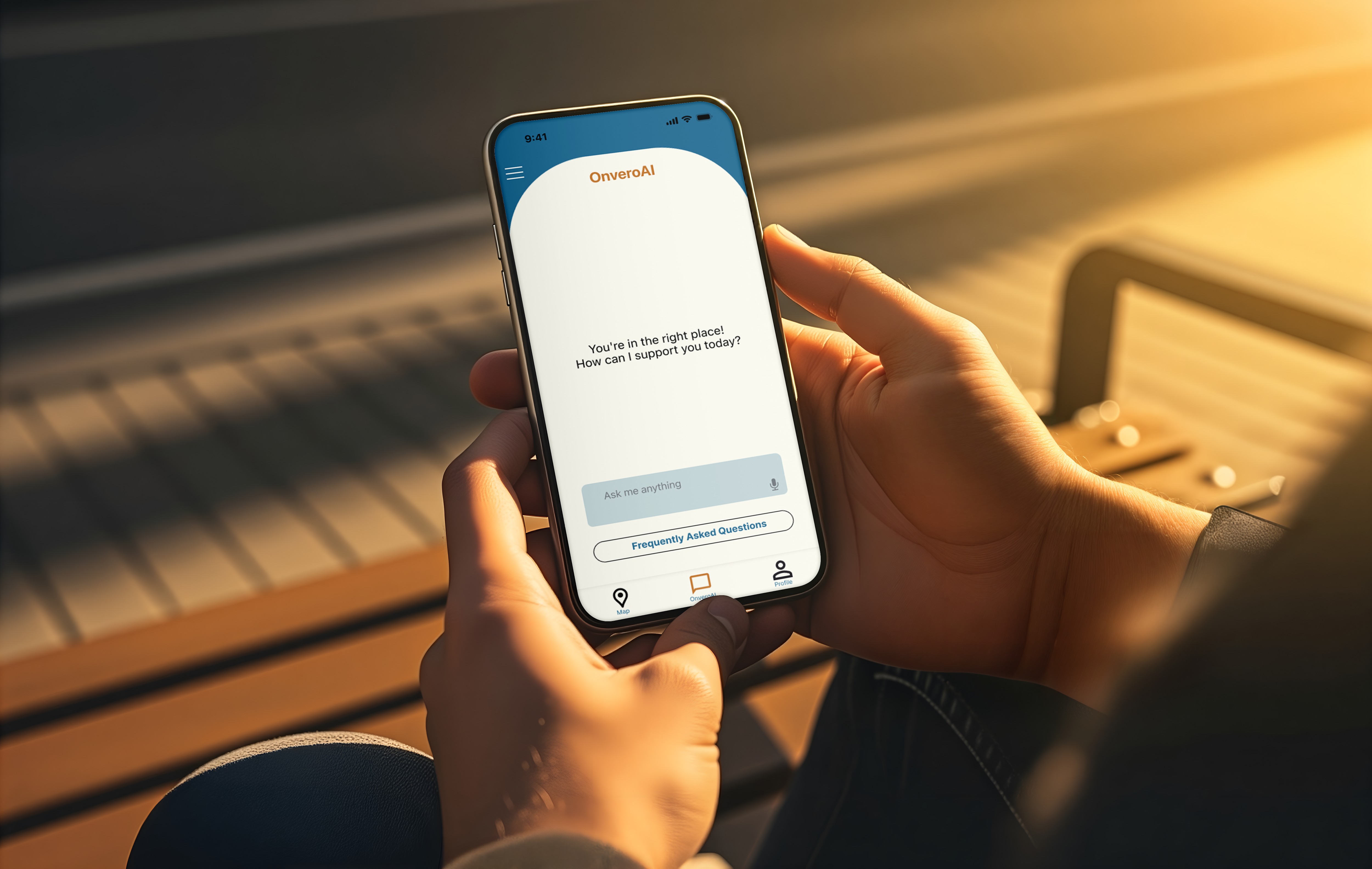
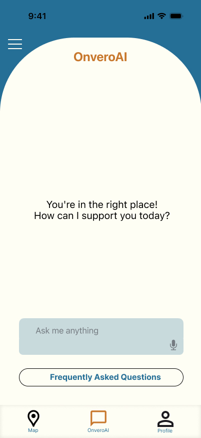
Rebranded as OnveroAI with transparent data handling explained upfront. Connecting the assistant directly to the verified platform increased trust.
Users didn’t believe services were truly verified. Without visible evidence, verification claims felt similar to the scams users were already trying to avoid.
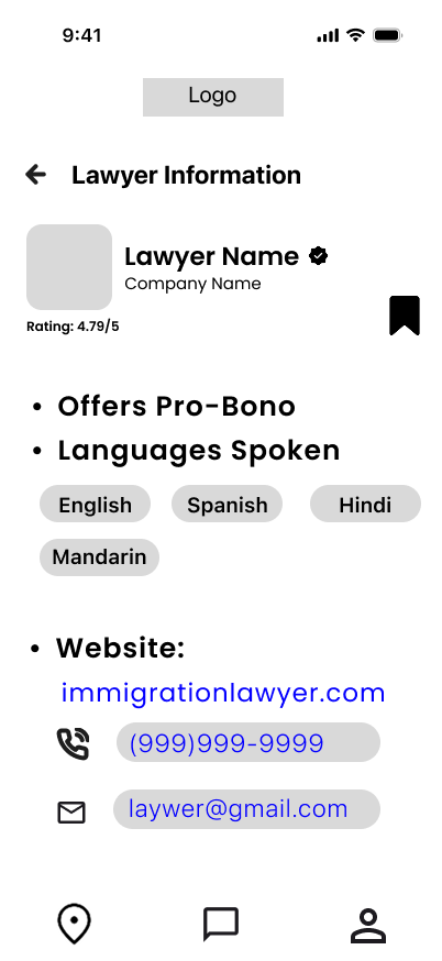
Verification became transparent. Users can see which organisation validated a provider and exactly why they can trust them before making any contact. Added a clear about us ensuring users can trust us too.
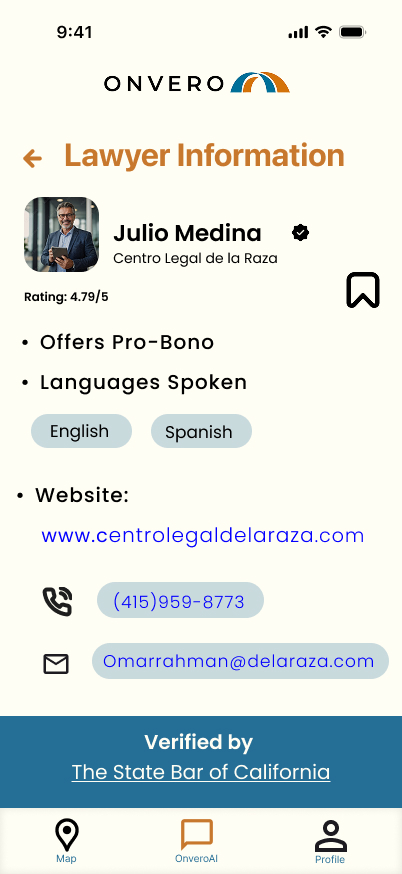
Users faced too many decisions per screen and often needed to jump between pages, disrupting their experience. My goal was to streamline navigation into a single “happy path.” Integrating OnveroAI with the Community Map was particularly challenging — with feedback from Kyle Zantos, I refined the architecture until we achieved a clear, seamless flow.
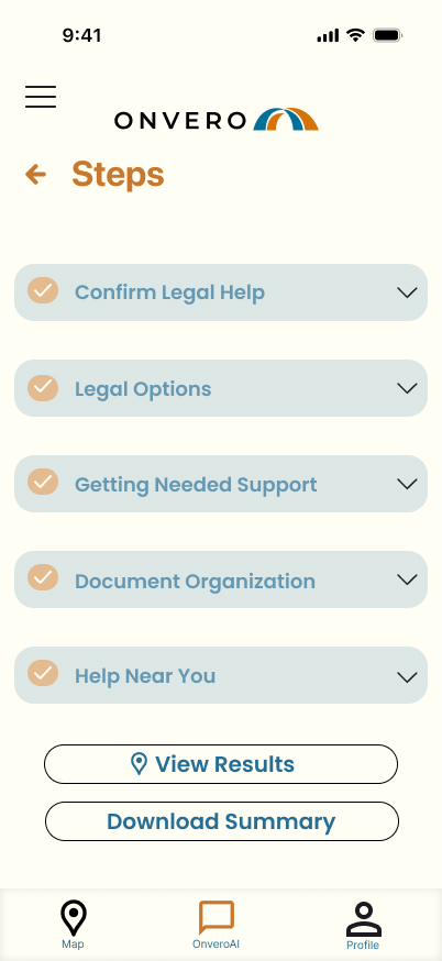
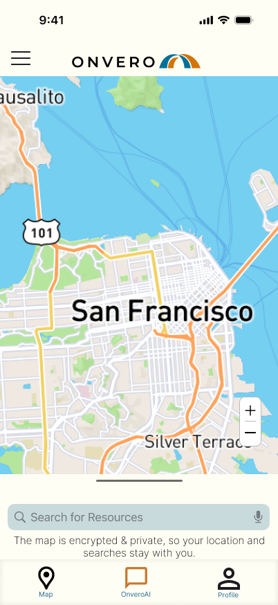
Accessibility was prioritised throughout the design process — inclusive interactions, clear visual hierarchy, and WCAG compliance — so the product can be usable and welcoming for people of all abilities.
Contrast ratios and colour combinations tested against deuteranopia, protanopia, and tritanopia to ensure legibility for all users.

Full voice interaction support for users with low digital literacy or physical accessibility needs. Designed so Maria could use the product without typing.
Bilingual support from day one, with Spanish prioritised given the primary community served. Further language expansion planned post-launch.

All copy written and tested at a sixth-grade reading level. Legal jargon replaced with plain language throughout — every label tested with low-English-proficiency participants.
Every screen evaluated against a single question: would Maria feel safe using this?
Together we stand, together we navigate.
Privacy Before Participation
Before asking for anything, Onvero explains exactly how user data is stored, who has access to it, and how privacy is protected. Trust is established before the first interaction. Users enter through a referral from a verified community partner — no search, no ads.

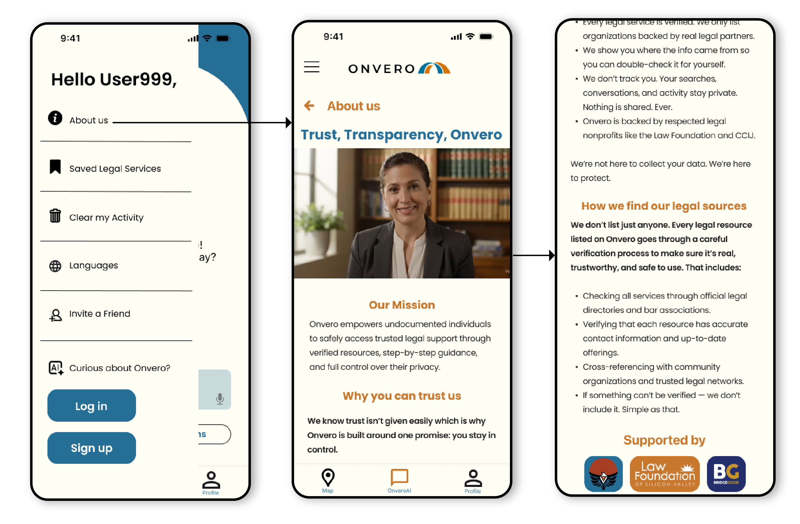
Transparency & Resolution
The About Us section surfaces the humans and organisations behind the platform. Users leave with a clear next step, verified contact, and the confidence to act.
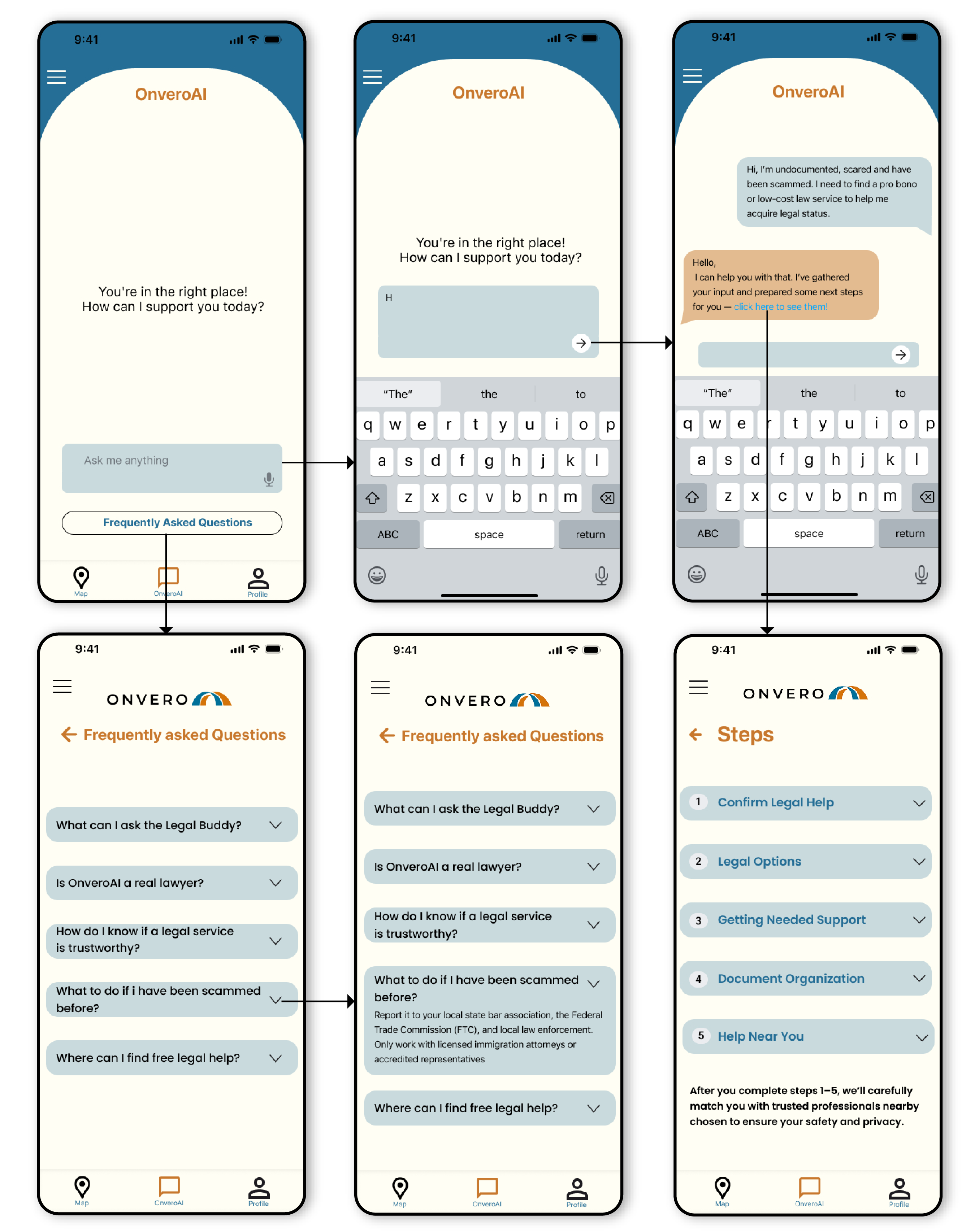
Trusted Access & Guided Support
OnveroAI then guides them through describing their legal situation in plain language, including voice input for low digital literacy.
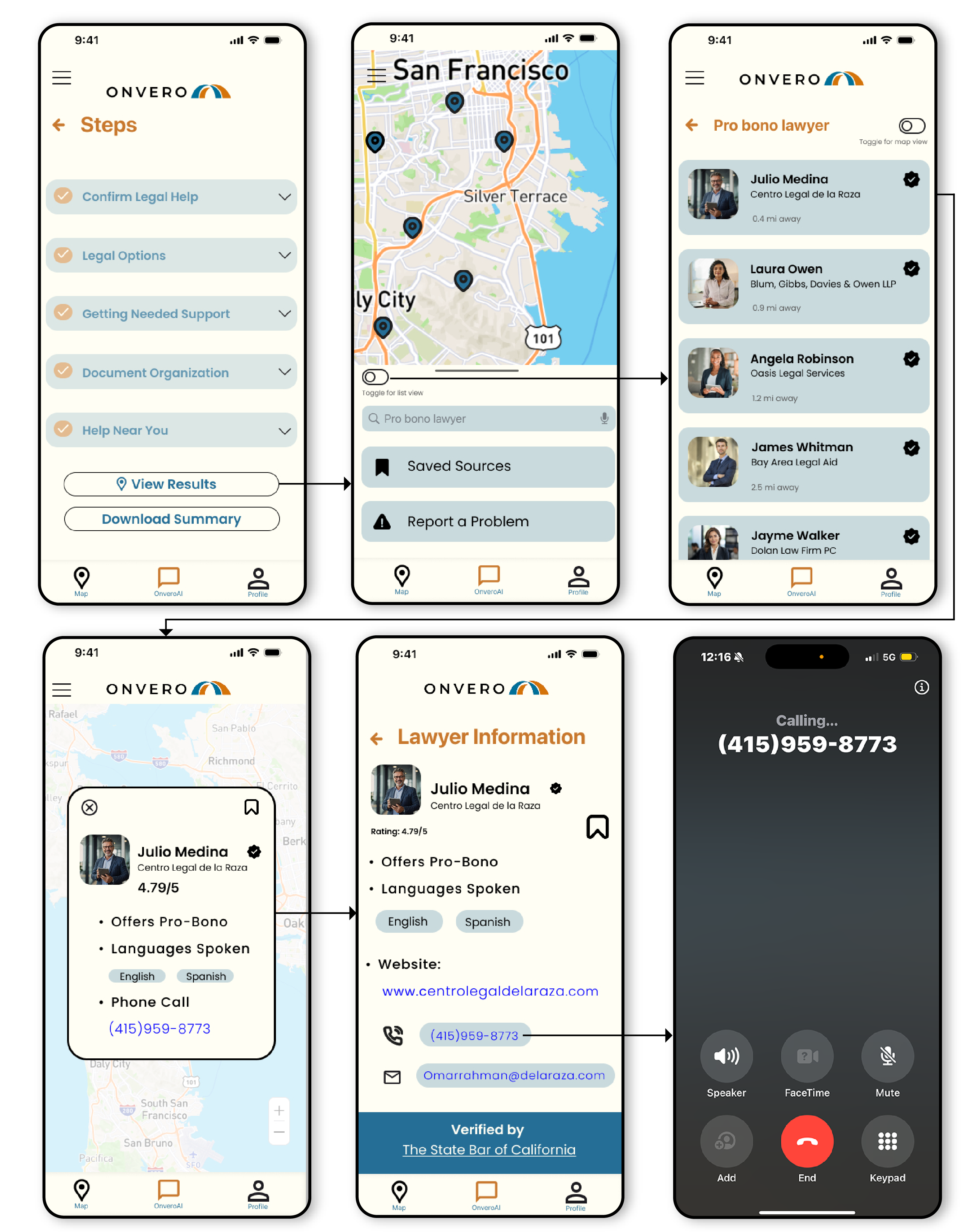
Community Map & Verified Services
Onvero surfaces verified legal services showing exactly where each community organisation is located. (Key Insight: Users trusted the service more when there was proof of a brick and mortar location.) Users see the evidence before making any contact.
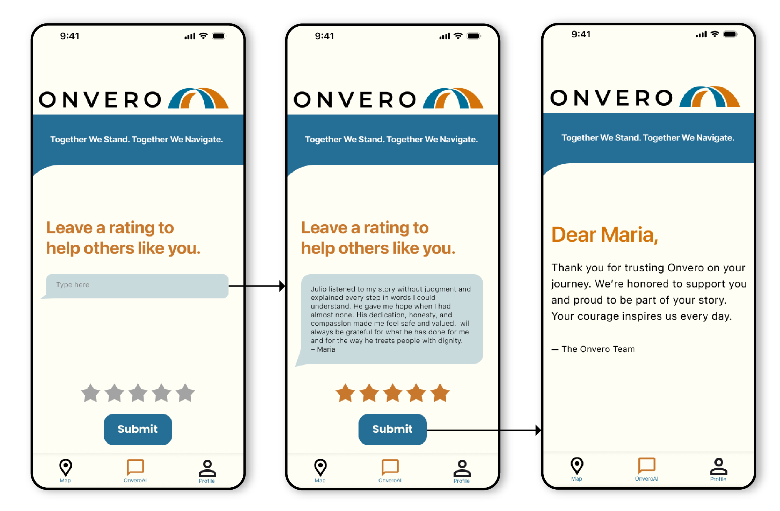
Community Reviews
Users can leave reviews and share their experiences with legal providers. Seeing feedback from people with similar situations helps future users feel more confident, reduces uncertainty, and provides an additional layer of trust before reaching out for support.
After redesigning the experience around trust, users completed the journey more frequently and expressed genuine confidence in seeking help — something they had avoided before.
“I feel safer knowing I’m not doing this alone.”
User testing participant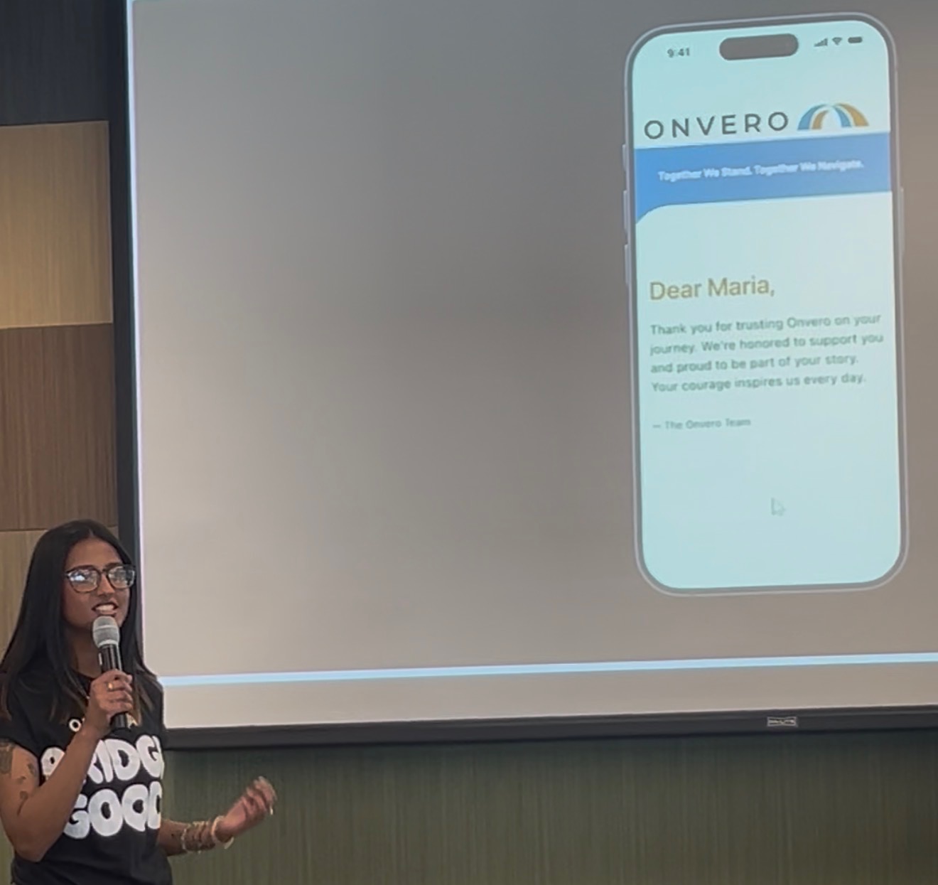
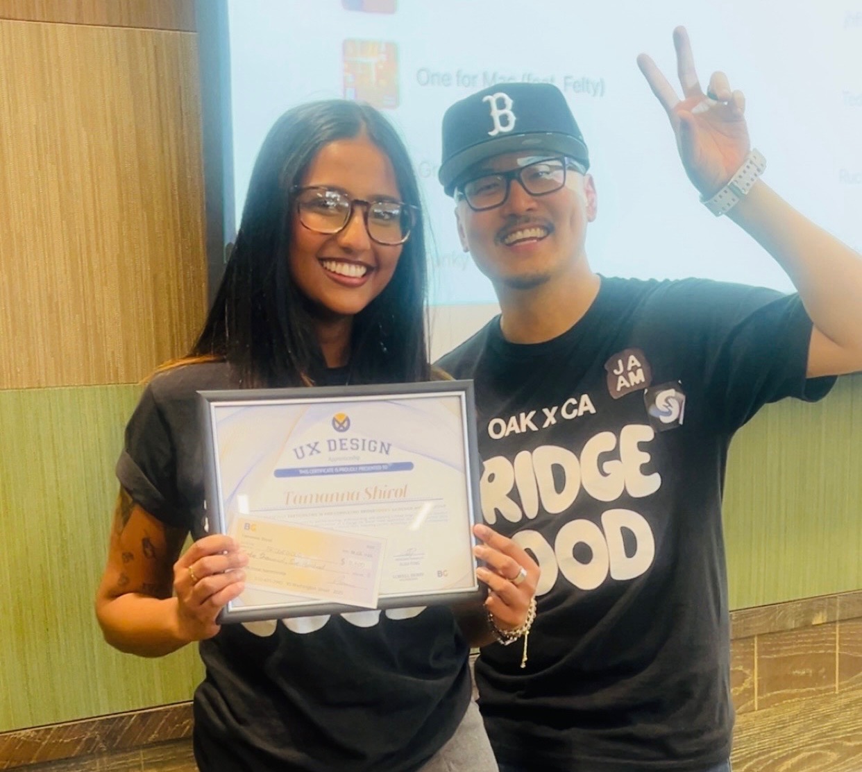
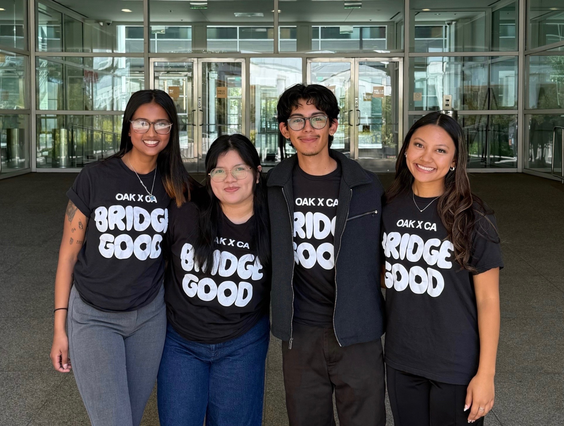
To keep Onvero strong and accessible, the model relies on grants, nonprofit partnerships, and mission-aligned sponsorships. No ads — all sources are found and verified independently so no organisation can pay to be featured.
To support the final pitch, the team created a marketing video communicating the problem, the impact of legal scams, and how Onvero helps users find trustworthy support.
Marketing video — created for the Wells Fargo product pitch
For vulnerable populations, trust isn’t a feature. Without it, users never engage. Every interaction either builds it or destroys it.
The best insight wasn’t validating assumptions — it was realising we were solving the wrong problem entirely. We came in thinking about access and left thinking about safety.
The strongest design decisions came from partnering with organisations that had already earned users’ trust. We couldn’t design trust in isolation.
Accessibility here meant language, literacy, emotional safety, and confidence — not just technical standards. That was a significant reframe for the team.
Good design doesn’t just reduce friction. It helps people feel capable of taking action they otherwise wouldn’t have taken.
Like AtlasTax, this project involved high-stakes, sensitive information. That shapes everything — tone, pacing, privacy, and what you ask users to give up.
Three areas of focus for the next phase of Onvero — each with early concept exploration.
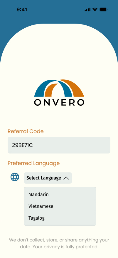
Expanding beyond English and Spanish to Tagalog, Vietnamese, and Mandarin to serve a broader share of the undocumented community across California.
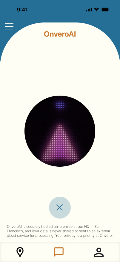
A fully voice-navigated mode for users with very low digital literacy, allowing them to access Onvero without any reading or typing requirements.
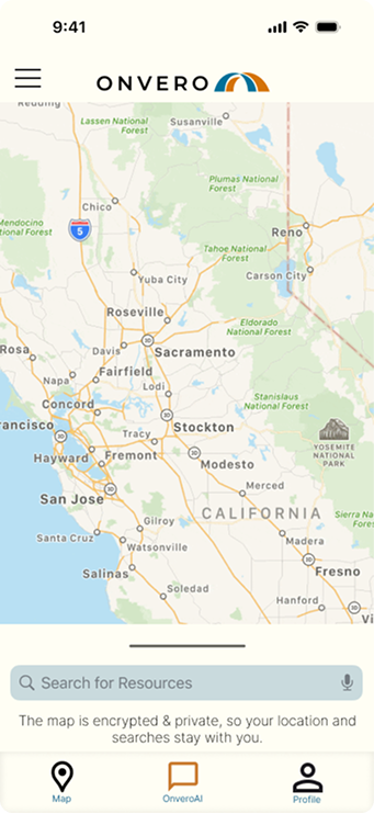
Growing the verified partner network beyond the Bay Area and building in-app case status notifications so users always know where they stand.