One wrong form could
cost you your visa.
How might we help international students understand exactly which documents they need and complete their tax forms accurately without confusion?
How might we help international students understand exactly which documents they need and complete their tax forms accurately without confusion?
A U.S. citizen earning under $15,750 doesn’t need to file. An 18-year-old international student with zero income still does — and one mistake can jeopardize their visa, immigration applications, and future employment.
“The system exists, just not for them. Residents have TurboTax. Non-resident students are left with confusion.”
1.2 million international students in the U.S. Nearly all carry annual IRS filing obligations. Almost none have a tool built for them.
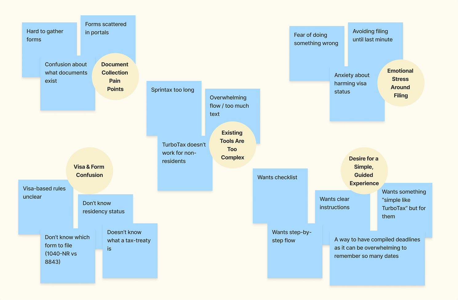
Pain point clustering — early interview synthesis
Two rounds of research which involved 12 interviews with F-1 and OPT students, followed by 15 usability testing participants evaluating the high-fidelity prototype.
“It would be ideal to have a tax-filing experience where they know all the dos and don’ts, and we can just click submit.”
F-1 student interview“The hardest part of filing taxes is compiling all tax forms.”
Survey respondent“Sprintax does not consider my tax treaty. What happens when I graduate?”
OPT student interview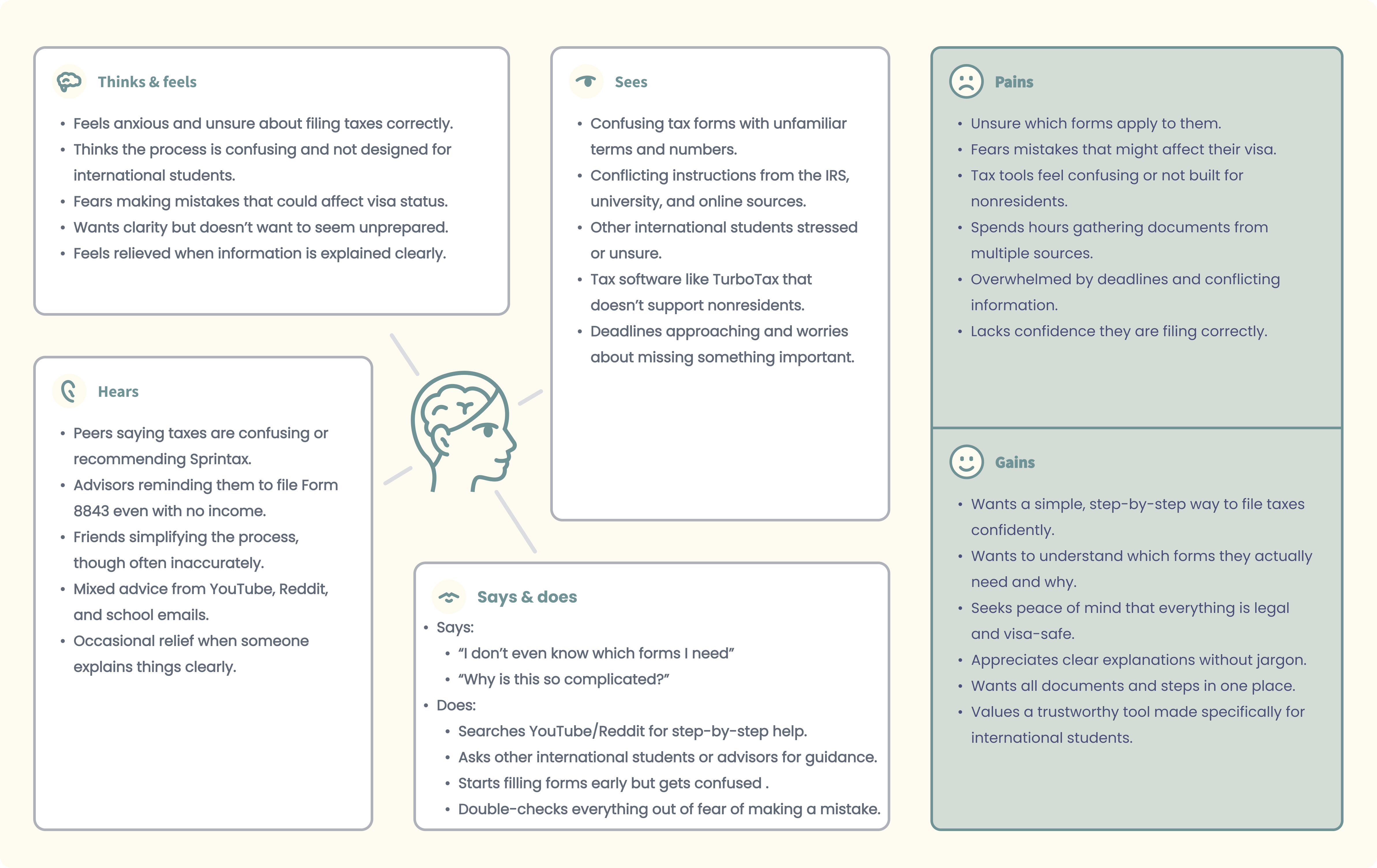
Empathy map — synthesized from interviews
Forms scattered across university portals, employers, and banks. Students spend hours finding documents they didn’t know existed.
Most don’t know their residency status, which form to file, or what a tax treaty means for them.
Fear of a mistake that affects visa status causes students to avoid filing entirely or panic through it at the last minute.
Two competitors dominate the space. Neither was built for non-resident students.
Supports non-resident tax returns, but the process is long, text-heavy, and prone to manual entry errors. Without a university partnership, the cost can feel high relative to the value provided.
Doesn’t support non-resident returns. Students who use it risk filing the wrong form entirely, which has real immigration consequences. Doesn’t let users know the difference between 1040NR and 1040.
| Product | Non-Resident | Tax Treaty | Student-First | Price |
|---|---|---|---|---|
| AtlasTax | F-1 · J-1 · M-1 | Auto-detected | Yes | $29 |
| Sprintax | Yes | Manual | Text-heavy | $100–150 |
| TurboTax | Residents only | No | No | $0–120 |
| H&R Block | Primarily residents | No | No | $35–85+ |
| CPA / VITA | Yes | Yes | Manual | $200–400 |
A proto-persona built from n=12 interviews. She represents the organised, tech-savvy student who just needs someone to make this make sense.
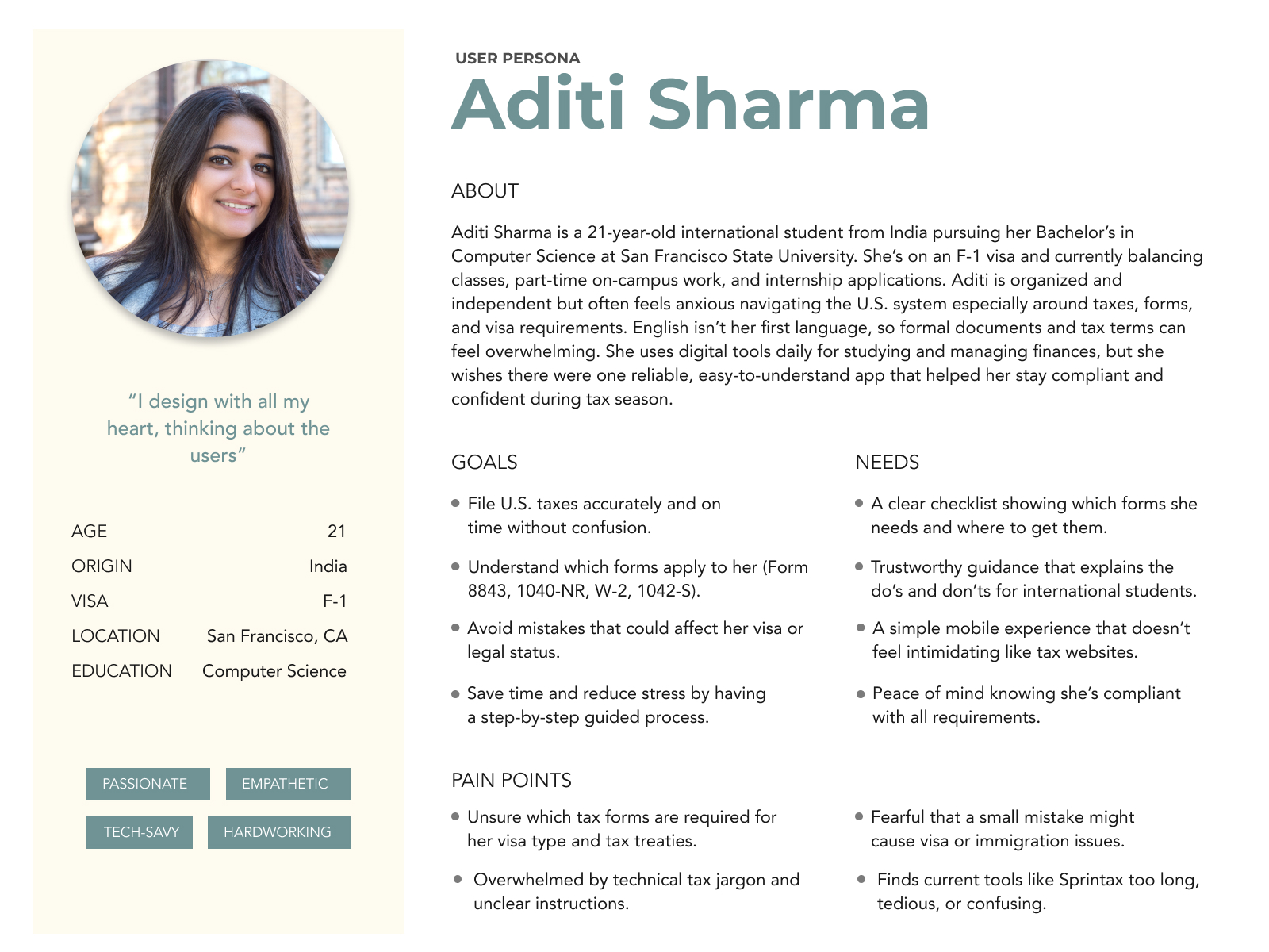
“I don’t even know which forms I need. Why is this so complicated?”
Aditi · 21 · F-1 · Computer ScienceFile U.S. taxes accurately without affecting visa or immigration status.
Doesn’t know which forms apply. Tax jargon feels impenetrable.
A trustworthy, step-by-step guide built specifically for her situation.
One small mistake affecting her visa, record, or future employment.
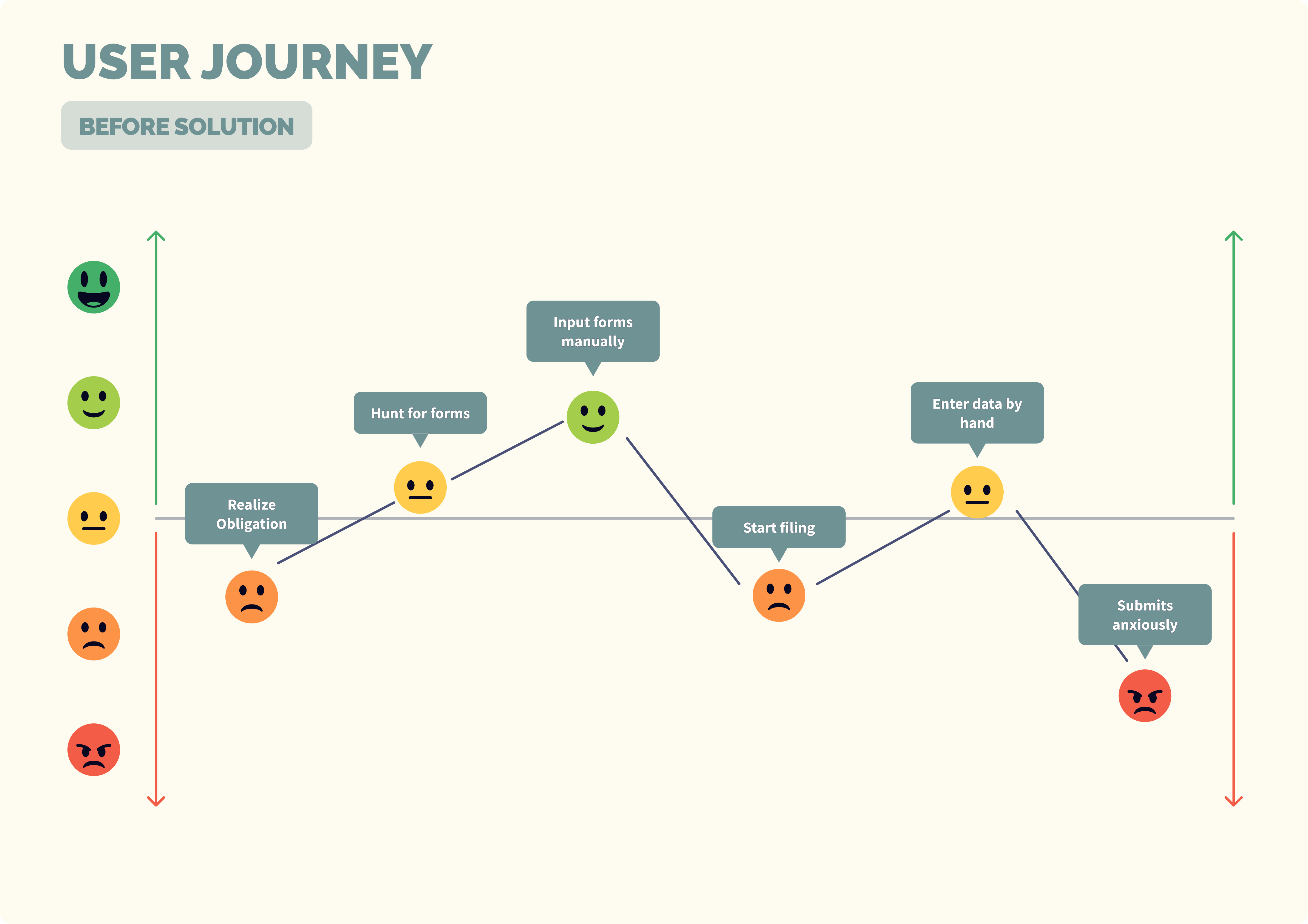
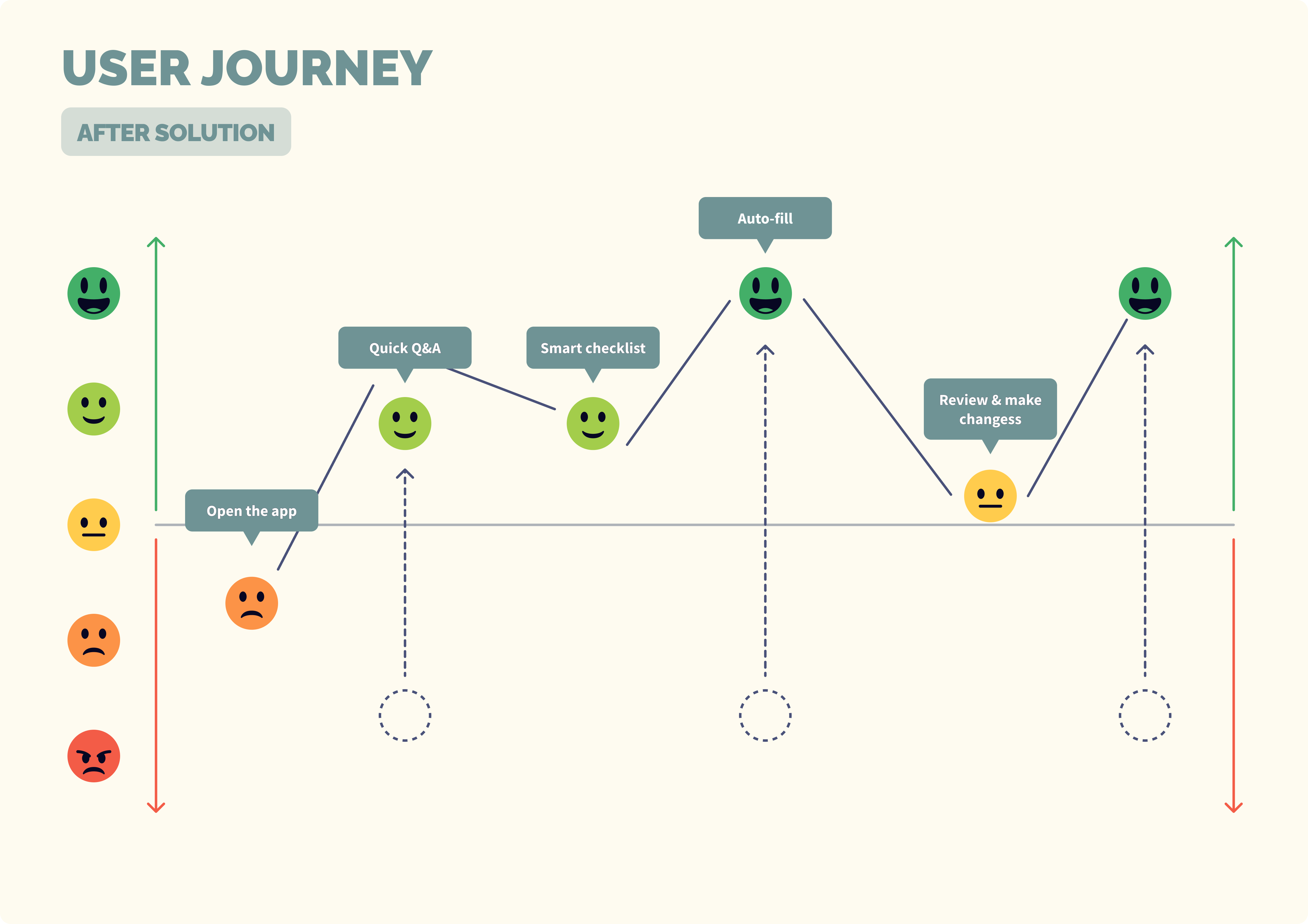
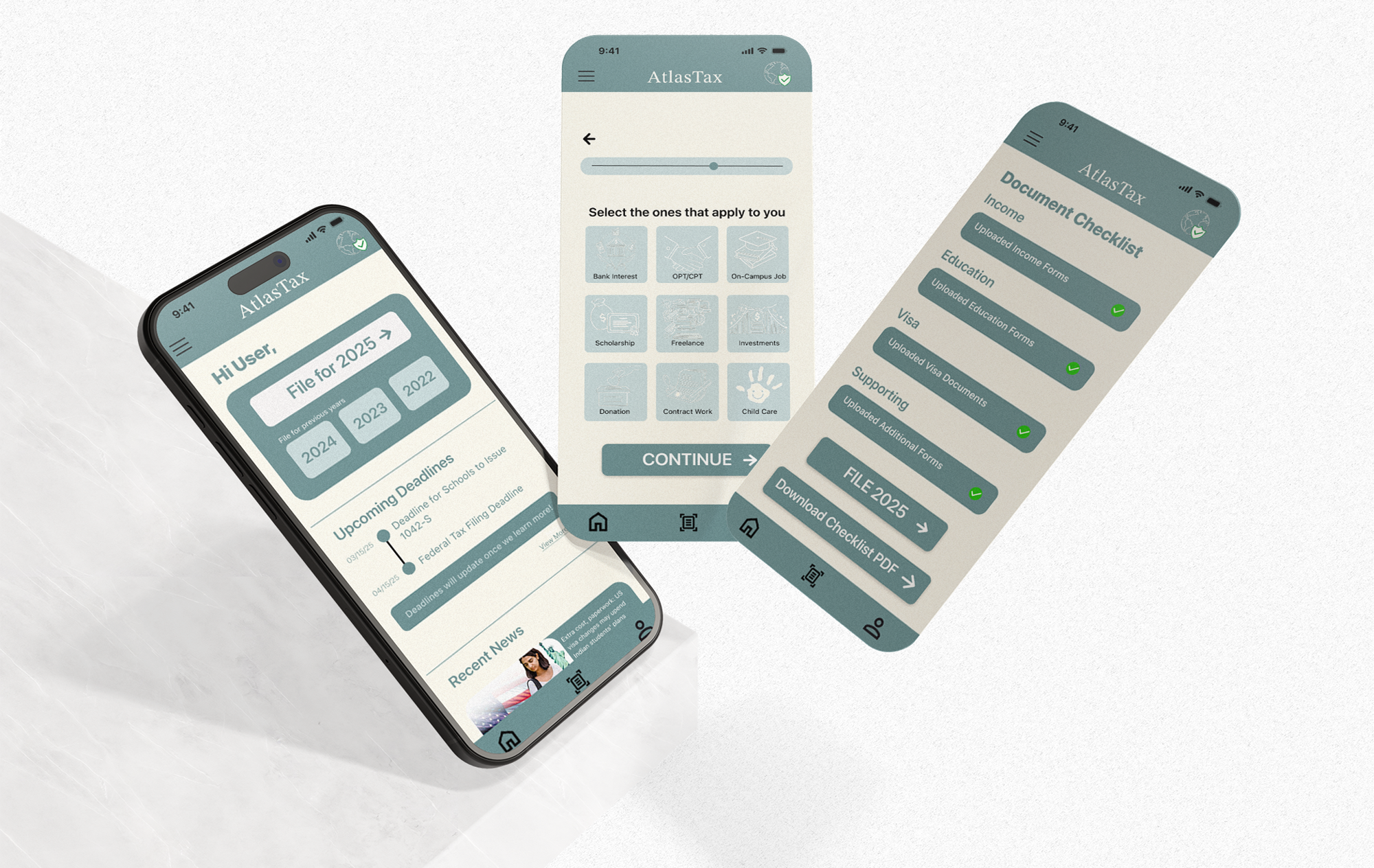
A mobile-first platform that enables F-1, J-1 & M-1 students to file IRS-compliant non-resident tax forms in under 20 minutes for $29.
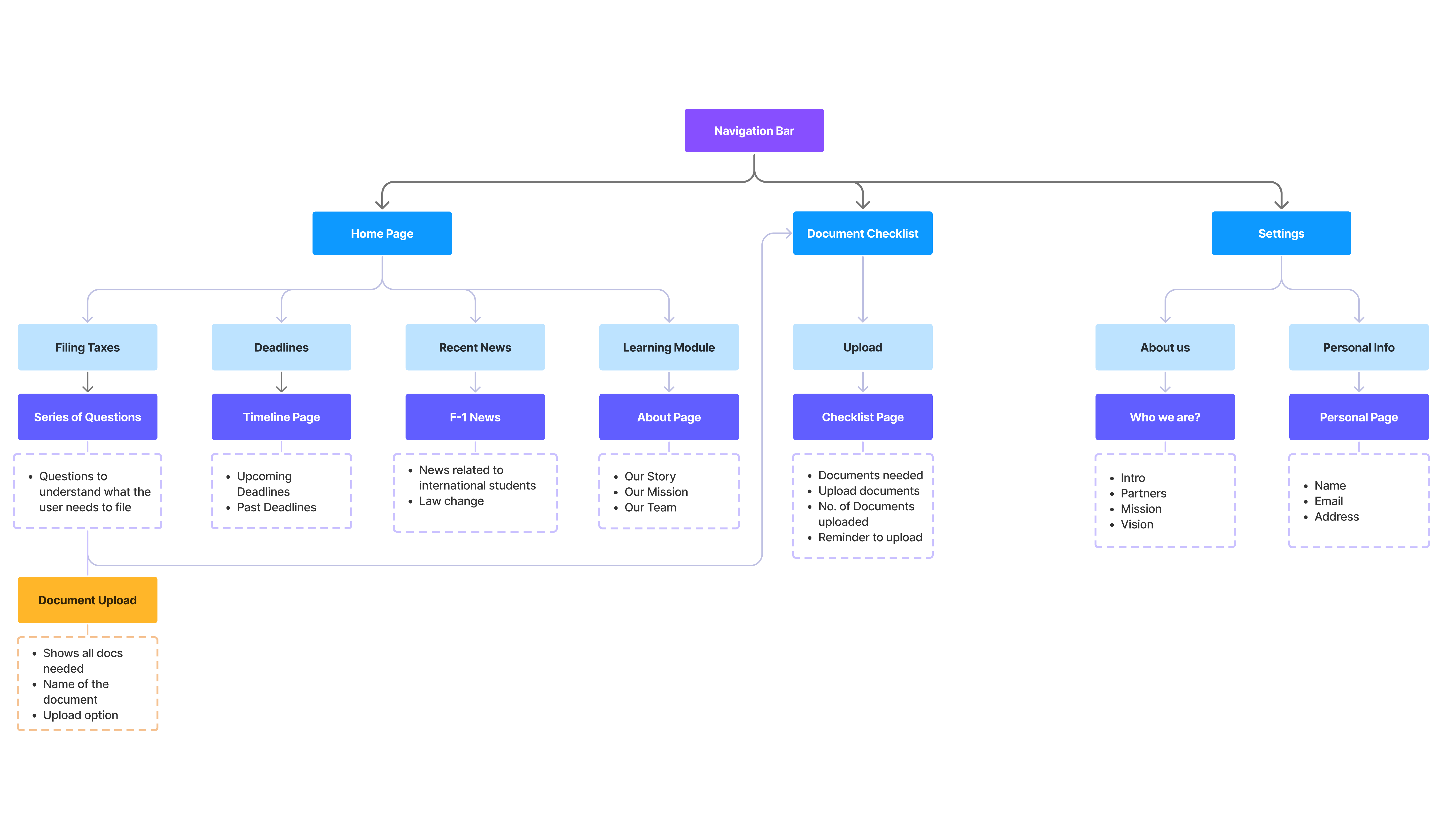
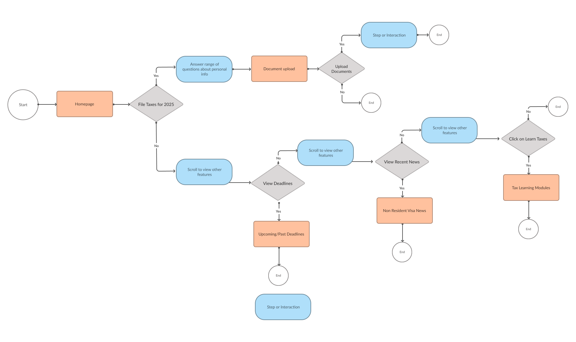
Before moving into high-fidelity screens, I mapped the product structure and core filing flow to make sure students could understand where they were, what information was needed, and what step came next.
Smart Onboarding
Students answer 10–15 questions to determine their correct filing path. Visa type, income sources, residency status — all used to personalise the experience.
Upload Documents
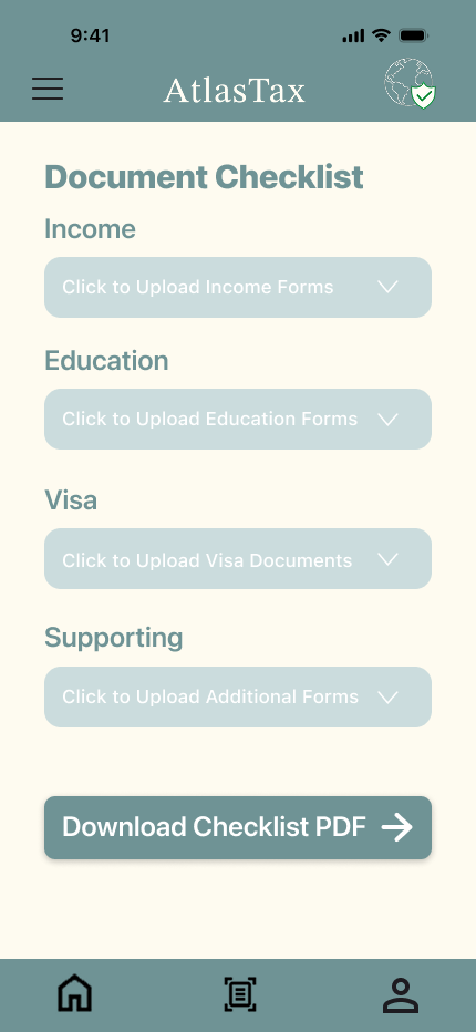
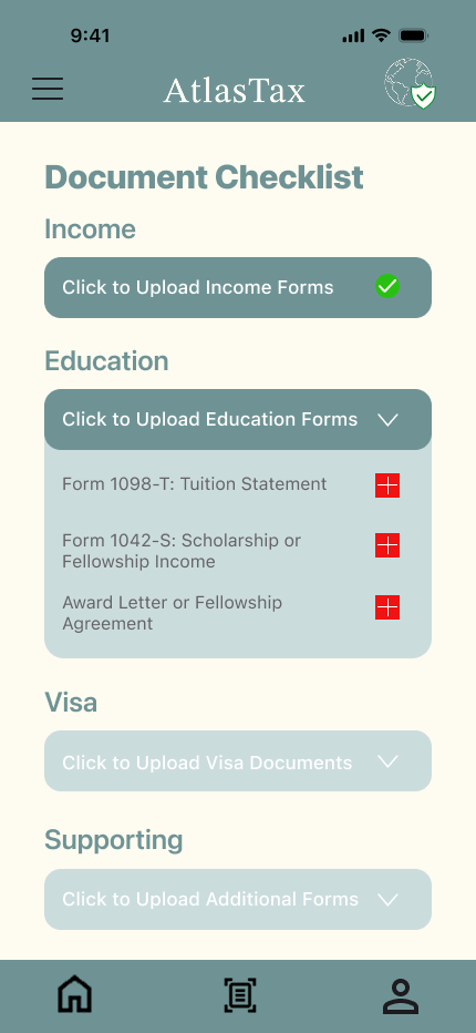
A personalized checklist shows exactly which documents are needed. Upload income, education, visa, and supporting forms. OCR extracts data automatically.
Forms Generated
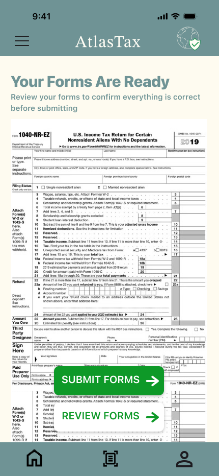
AtlasTax prepares the correct IRS forms automatically. Review, download, sign, and mail — or e-file directly. No manual data entry, no transcription errors.
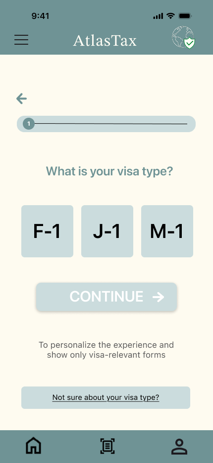
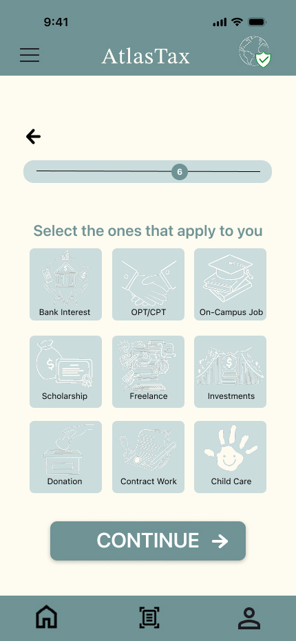
Starting on paper to explore structure without committing to visuals. Three sketch sheets, then digital wireframes, then high-fidelity.
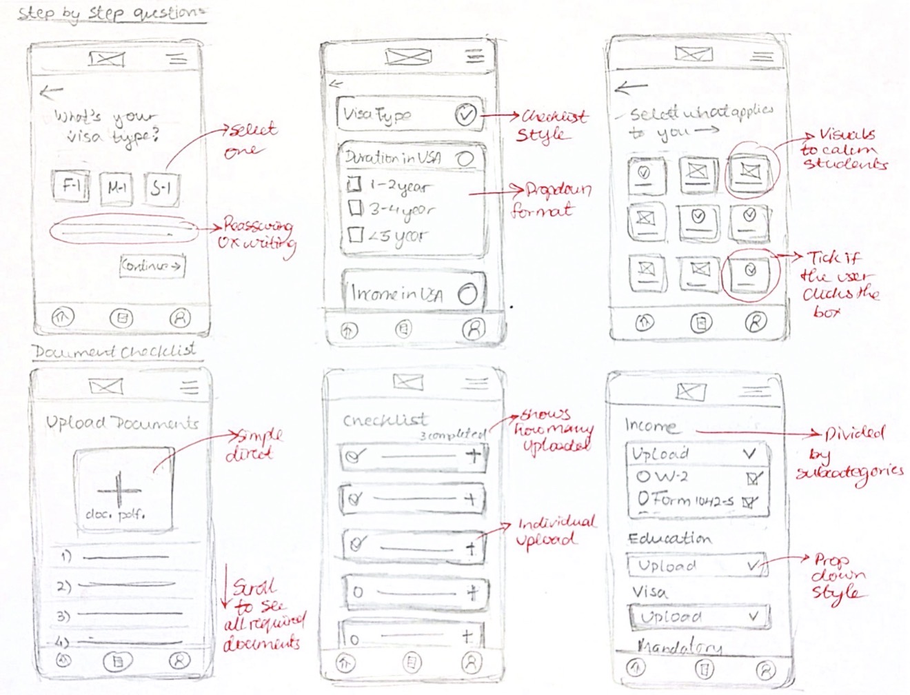
Onboarding Q&A + checklist
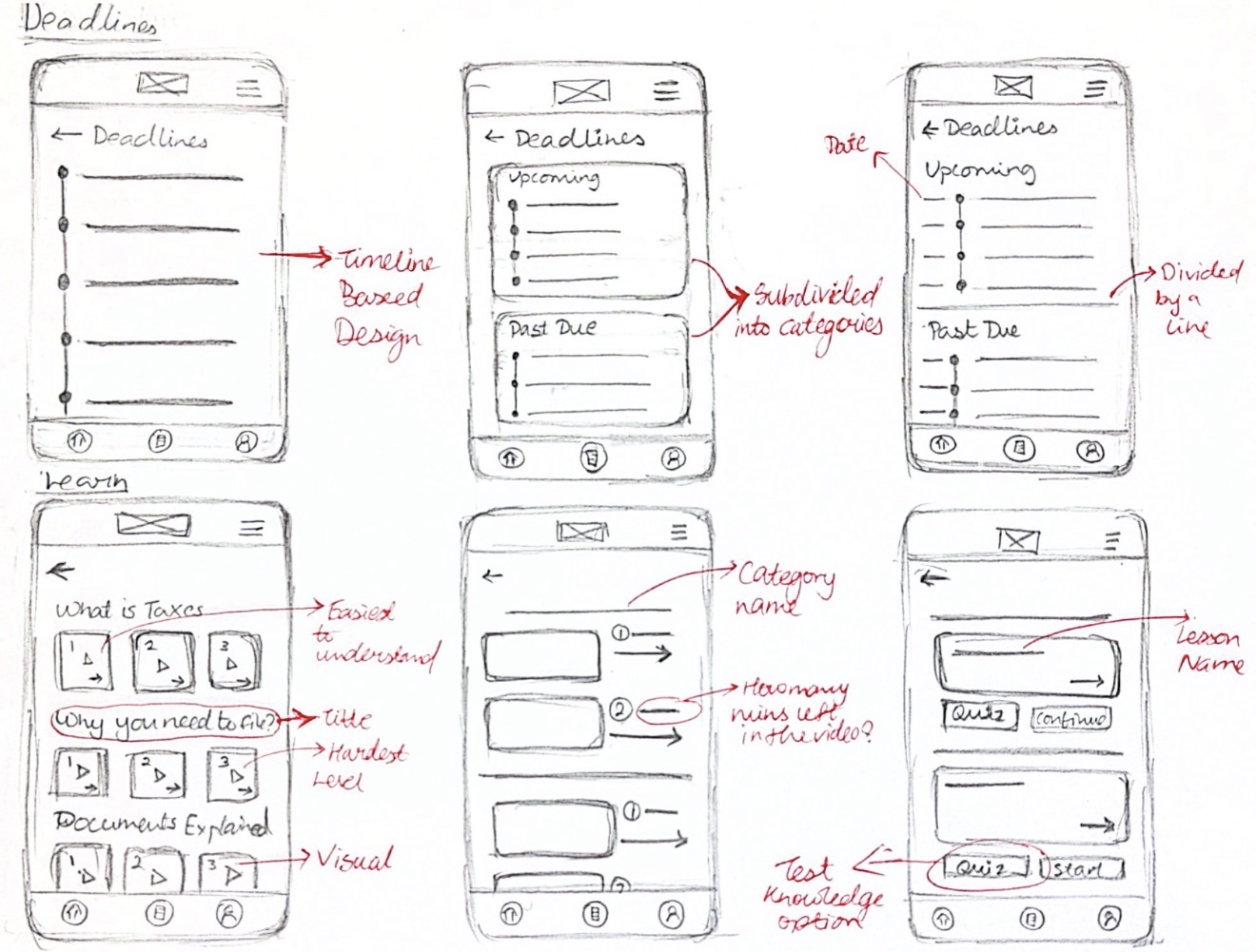
Deadlines + learn screen
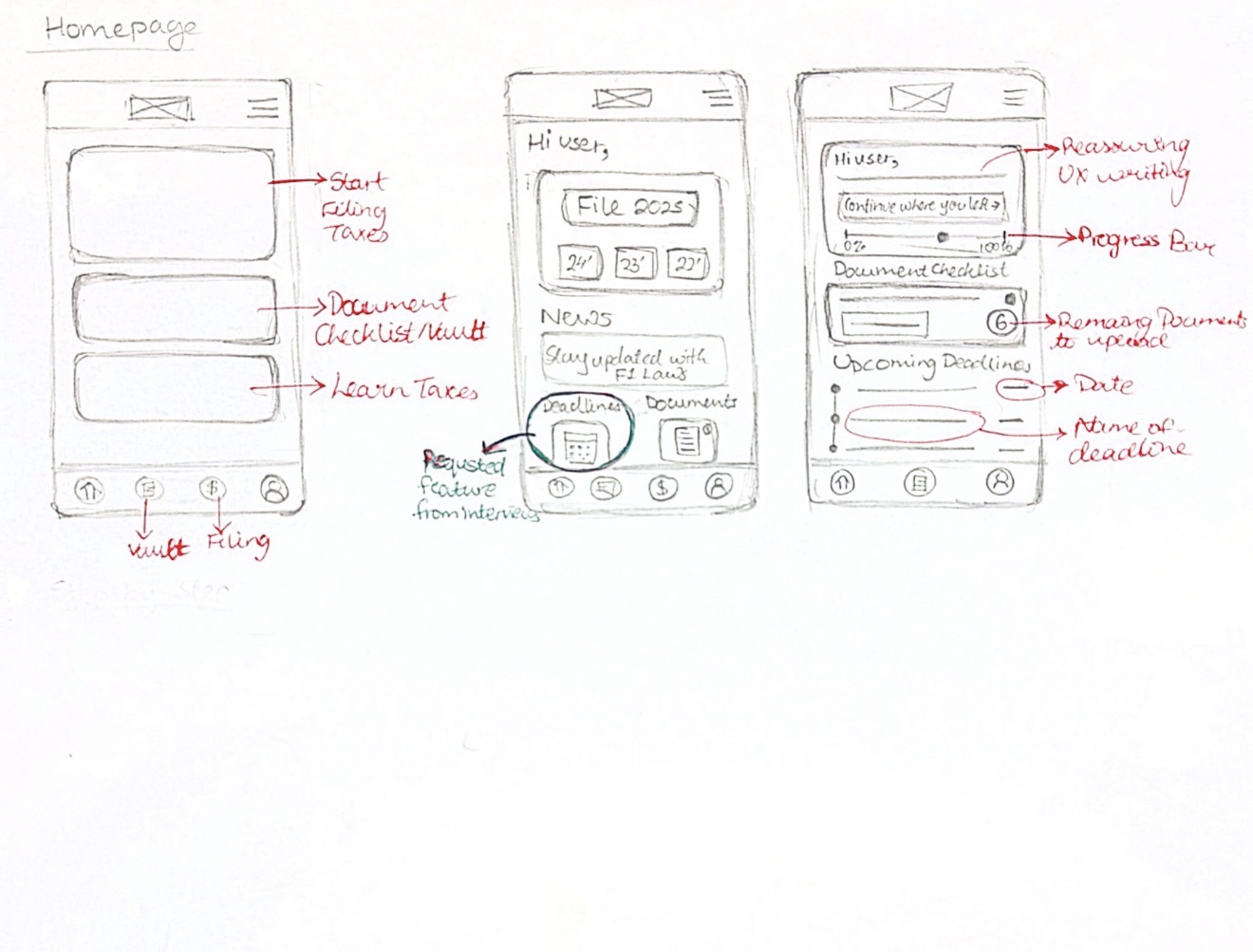
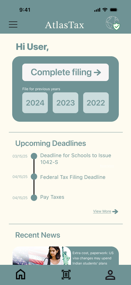
Homepage explorations
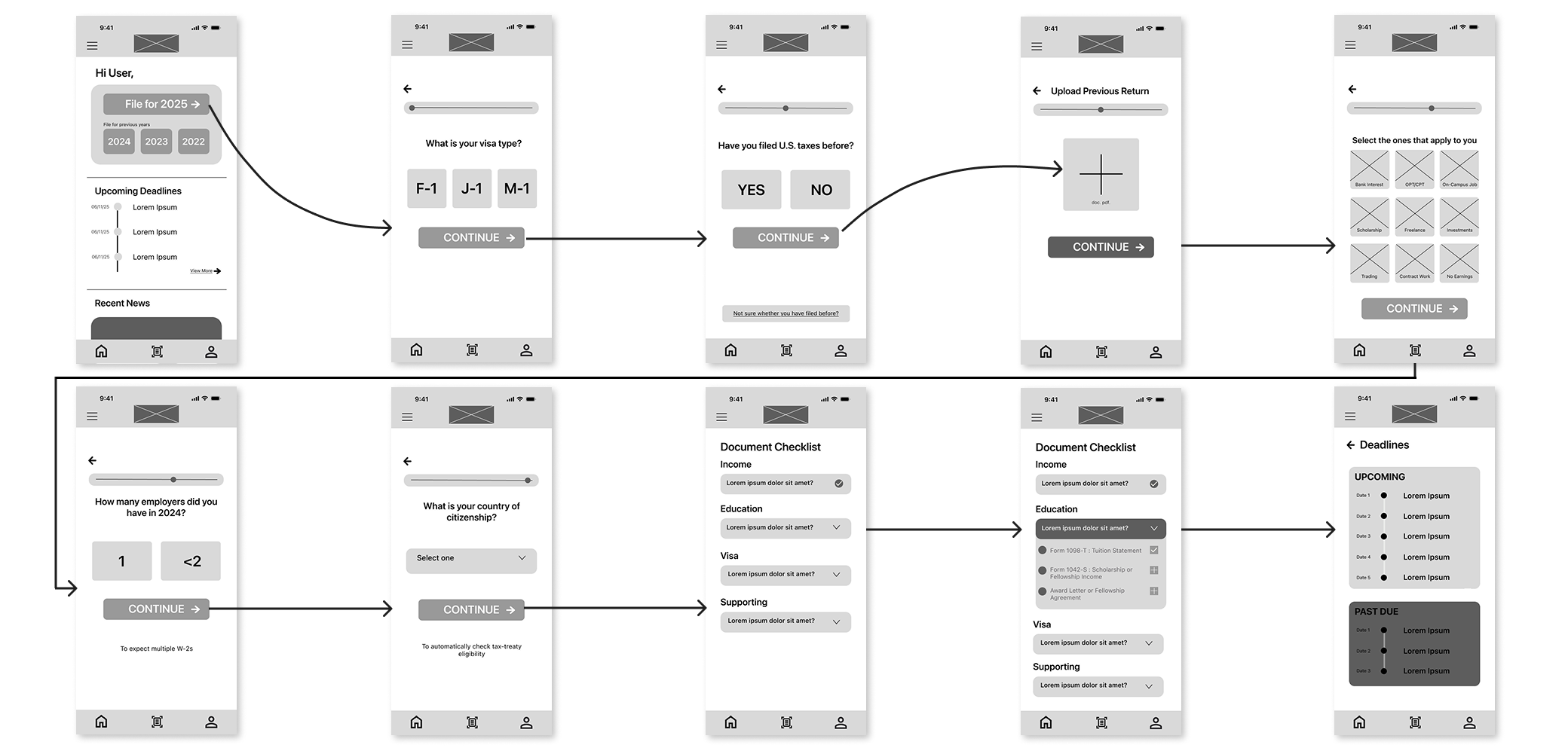
Mid-fidelity wireframes — full user flow
The design system was built to feel calm and trustworthy — deliberately opposite to the anxiety students already feel about taxes.
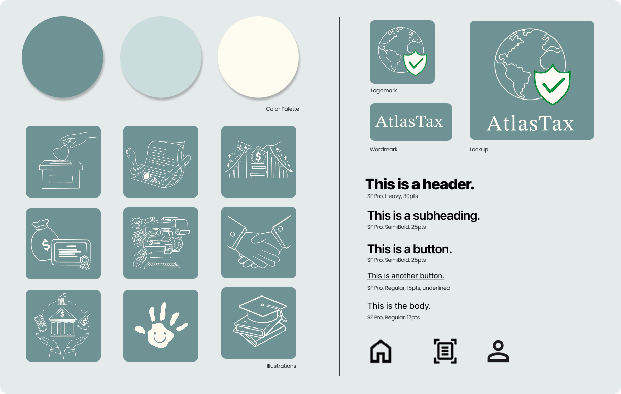
Design system — colour, type, illustration, brand
Three rounds of think-aloud testing. Each session surfaced something that would have broken the experience in production.
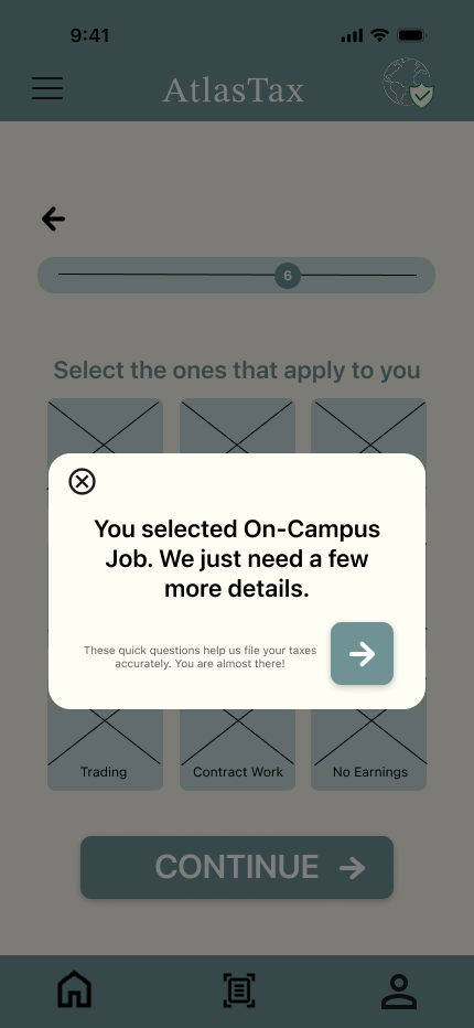
Watch think-aloud sessionWhen users selected scholarship, on-campus job, or freelance, the screen jumped to a new question with no warning — breaking the expected select → continue pattern. Users thought it was a bug.
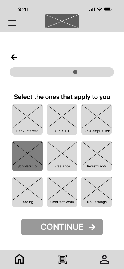
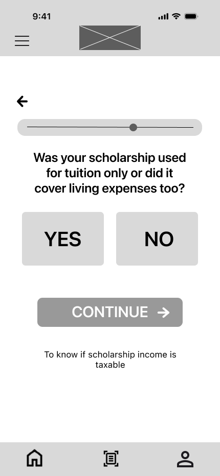
Added a popup heads-up before any additional question appears. The flow now matches the pattern users have built throughout the rest of the onboarding.
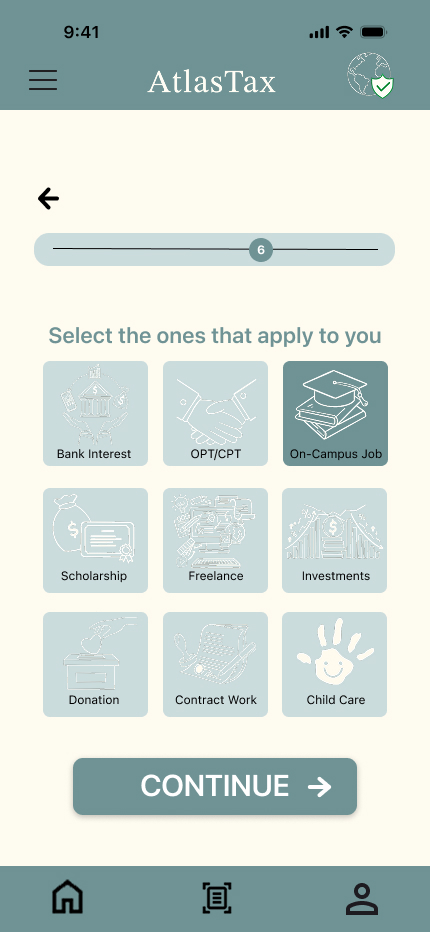
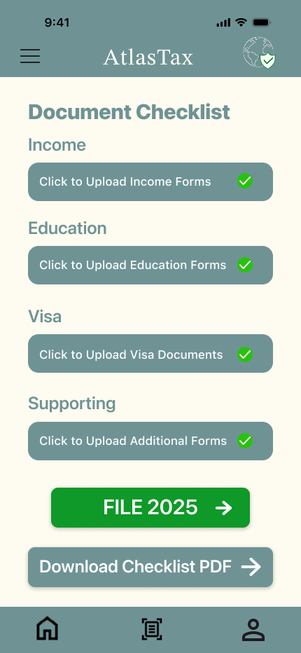
After uploading documents, users had no clear way to actually file. They also had to open every category individually with no sense of overall progress or completion.
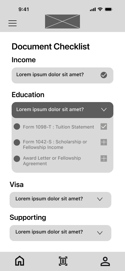
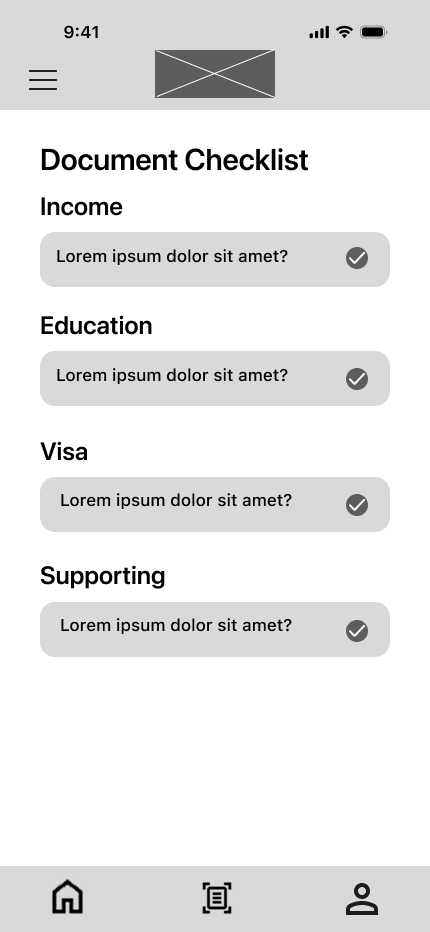
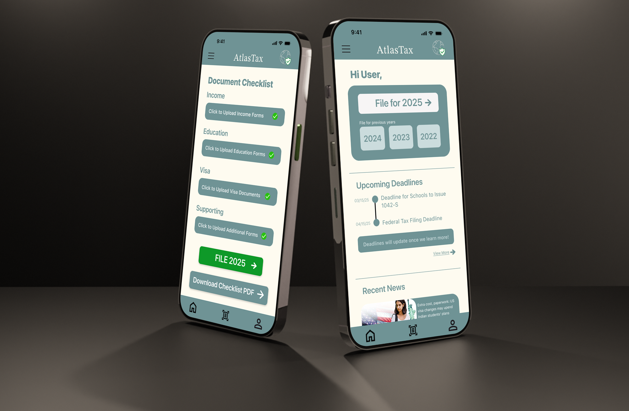
Added a “FILE 2025 →” button that appears once all documents are uploaded, and a “Download Checklist PDF” option. Green checkmarks make completion state unambiguous.
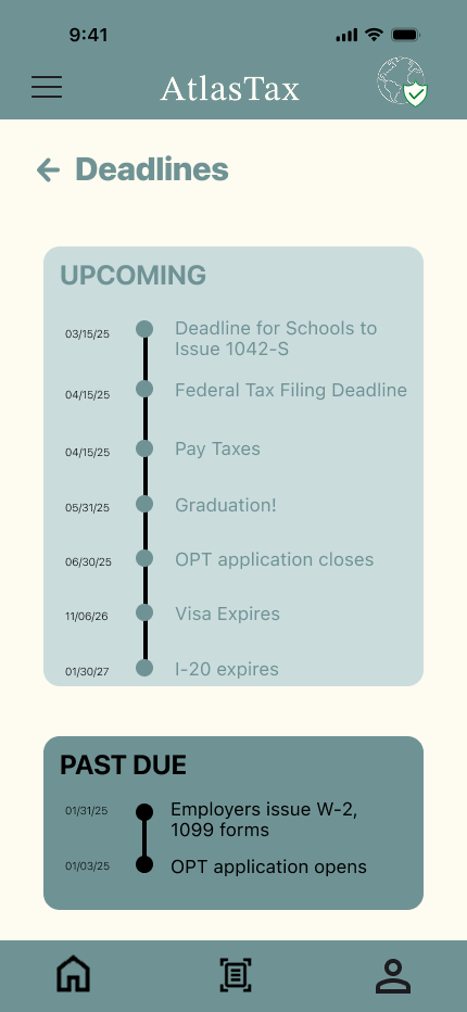
Users questioned why the deadlines section existed — “I can just Google this.” The feature needed a reason to exist beyond tax season to justify its place in the app.
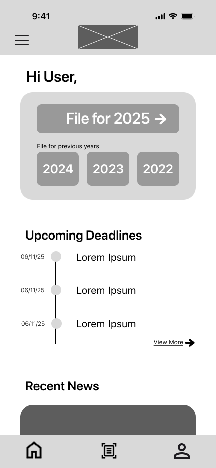
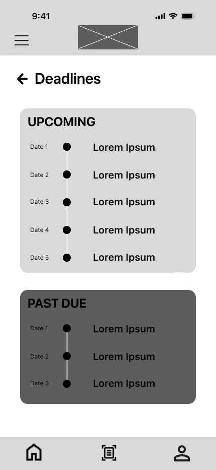
Deadlines are now personalized once documents are uploaded — including OPT application windows, visa expiry, and I-20 dates. The app becomes useful year-round, not just in April.
Users were unsure what some questions meant and why they were being asked. The flow assumed prior knowledge, causing confusion and making users less confident in their answers.
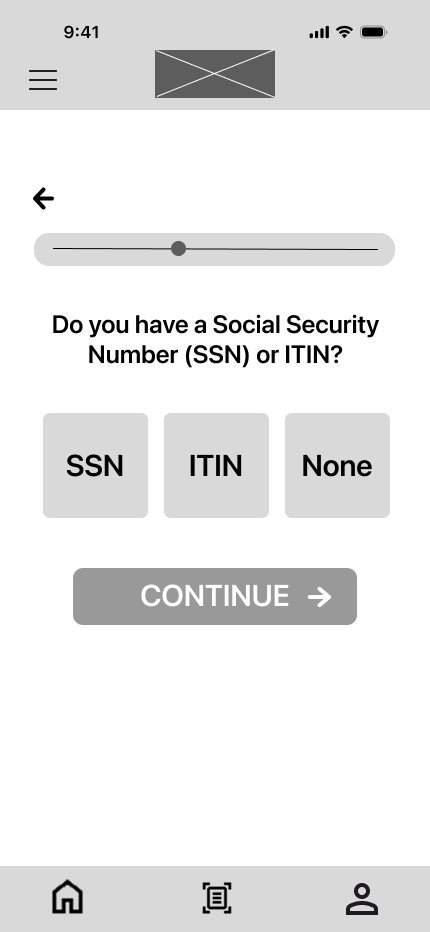
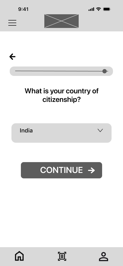
Added a brief explanation for each question and a link to a verified source for additional context. Users can now understand the purpose of each question and answer more accurately.
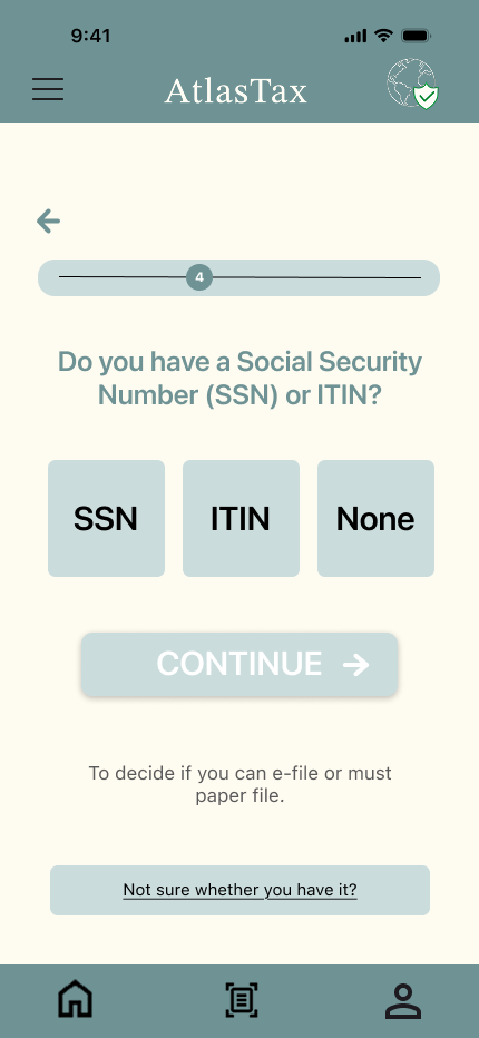
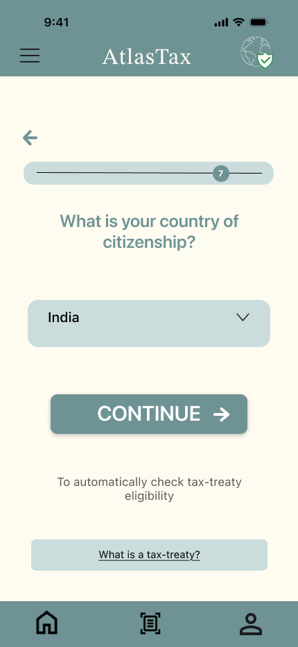
Note: this is an ongoing project. These iterations reflect the transition from mid-fidelity to high-fidelity. The experience is still being refined before engineering handoff.
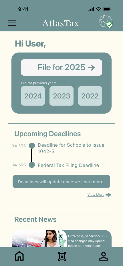
Homepage
Q&A onboarding
Q&A onboarding 2
Document checklist
Filing
Deadlines
Personalised
Measured through post-testing with 15 F-1 students after completing the high-fidelity prototype task flow. They didn’t just find it easier — they wanted it.
“This is exactly what we needed. It breaks down the complexity in a way I actually understand.”
Phase 3 usability testing participant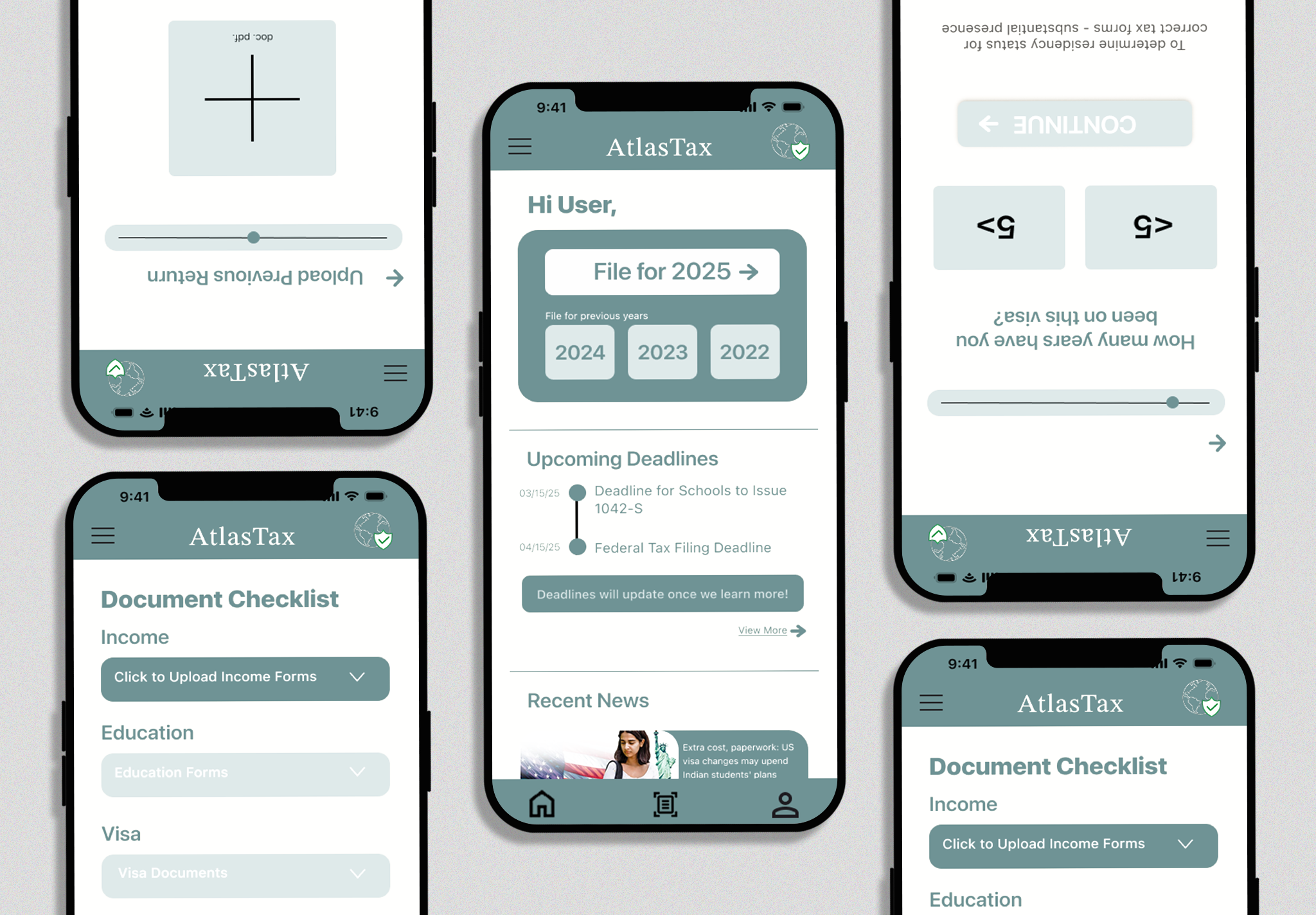
This project made me realise how different it is designing for high-stakes, sensitive data. Every interaction carries real anxiety. Tone, clarity, and trust aren’t nice-to-haves — they’re functional requirements.
Taxes feel impossible. But structuring information correctly — not dumbing it down — is what turns overwhelming into manageable. That distinction took multiple iterations to understand.
Three users in phase 1 caught the broken flow interaction. Three more in phase 2 revealed the missing file CTA. You don’t need a hundred participants to find what’s broken.
94% reduced anxiety is a product outcome. If users feel scared navigating your interface, the design failed regardless of how clean it looks.
The 90% preference rate came from sitting with students and hearing their actual pain — not from confidence in my design instincts.
The Learn Taxes module, e-filing integration, and more visa types are next. Taking this to engineering is the goal. This is still being built.